Works
Schedule a call


Studio pinto
Working as a freelancer with Studio Pinto, I contributed to various client projects. Each project was realized with unique design solutions, centering on user needs and business objectives. Detailed case studies for these projects can be accessed via the respective links or in subsequent sections of the portfolio.
Studio pinto

Details
Industries
Design agency
My role
Freelance product designer
Tools
Figma
•
Rive
•
Miro
•
Framer
My role & Responsibilities
Based on project needs, I undertook a wide range of responsibilities, from concept development and user research to creating wireframes, prototypes, and final visual designs and animations.
- User experience (UX) and user interface (UI) design for clients in various sectors.
- Developing interactive and aesthetically strong designs for web and mobile platforms.
- Translating brand identities into digital environments.

Two Boxes - Webpage and Animation Design
Two Boxes
Context
Two Boxes simplifies the complex operational processes for returned products in online shopping. They approached us (Studio Pinto, with me as the freelance designer) to update their existing web pages and to visually explain their intricate service flow. The project duration was 4 months, and I was the sole designer.
Problem
The primary challenges were to modernize Two Boxes' web presence and to find an engaging and clear way to communicate their complex return logistics and service design to potential clients. Their existing website did not effectively convey the value and intricacies of their solution.
Solution
A comprehensive redesign of their web pages, coupled with custom-designed animations created in Figma (using custom drawings) to illustrate their operational flow. A detailed design guideline was also established. The final website was developed in Framer.
Process
Client Collaboration & Briefing
Worked closely with the Two Boxes team to understand their service, target audience, and project goals.
Client feedback and communication examples from the Two Boxes project, showing comments on design mockups.
Web Page Redesign
Conceptualized and designed new layouts for all required web pages, focusing on clarity, user experience, and modern aesthetics.
Redesigned webpage layout for Two Boxes, showing blog and results sections.
Animation Design
Designed and created animations directly in Figma using custom illustrations to visually break down and explain Two Boxes' complex service flow.
Website animation video for Two Boxes, showcasing their ecosystem and service integrations.
Design Guideline Creation
Developed a design guideline detailing the usage of fonts, icons, and color palettes to ensure brand consistency.
A collection of pages from the Two Boxes brand style guide, establishing rules for brand assets like the logo, colors, and fonts.
Responsive Design
Ensured all screen designs were fully responsive across various devices.
Responsive design mockups for the Two Boxes website, showcasing desktop, tablet, and mobile views.
Developer Handof
Prepared and delivered all design files, including detailed animation specifications, to the developers for implementation in Framer.
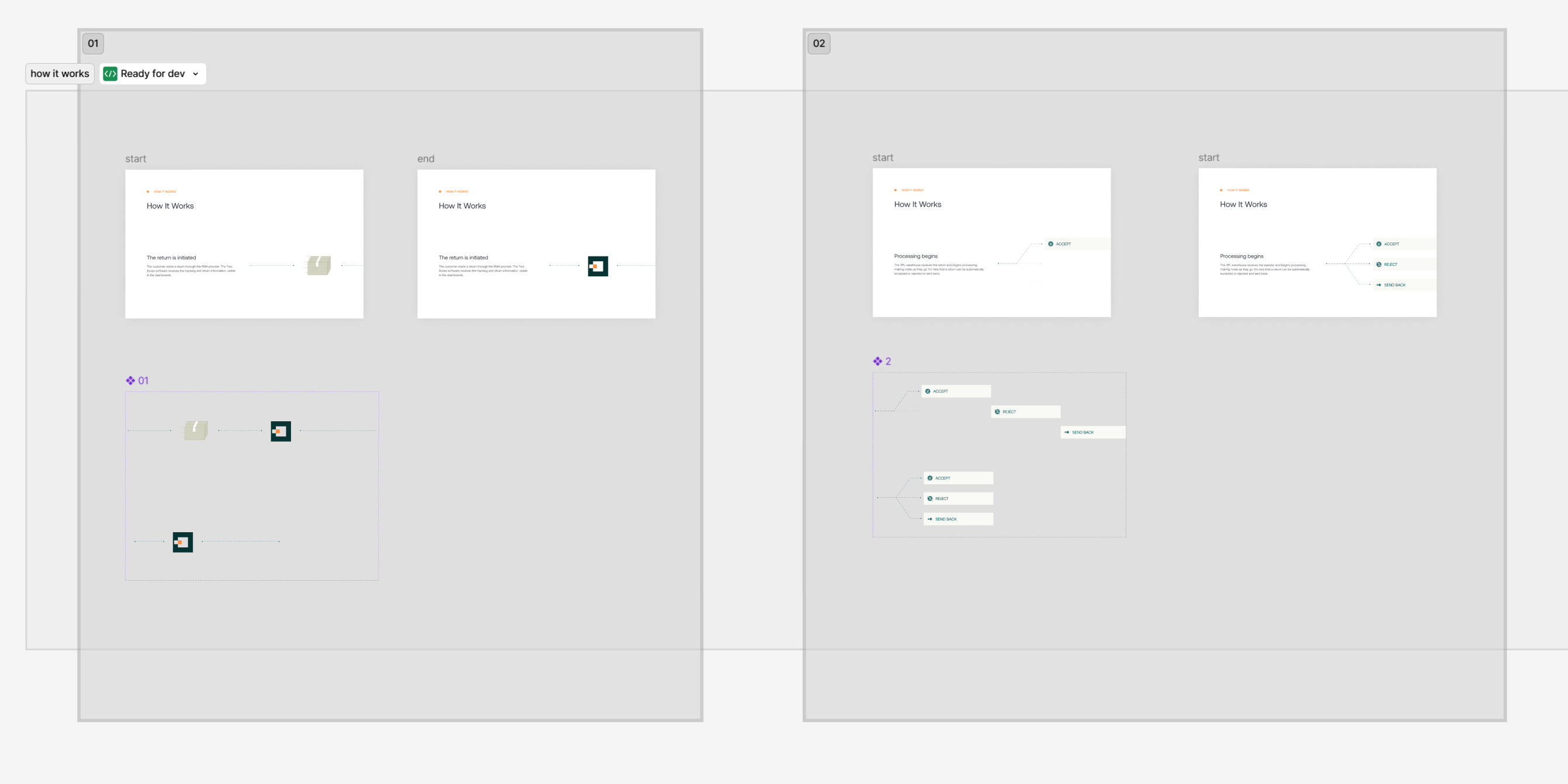
Step-by-step animation specifications for developers, showing the start and end states of UI components.
Development Support
Collaborated with developers during the Framer development process to ensure accurate execution of the designs and animations.

Image representing the debugging and development support phase, with the Two Boxes website shown alongside its code.
Impact
Enhanced User Experience
The redesigned website effectively translated Two Boxes' intricate service model into an accessible and engaging user experience.
Clear Value Proposition
Custom animations successfully clarified the complex operational flow, enabling potential clients to better understand the value proposition.
Improved Brand Image
The new, modern aesthetic of the web pages received positive feedback and contributed to a more professional brand image.
Foundation for Consistency
The established design guidelines provided a solid foundation for Two Boxes to maintain brand consistency in their future visual communications.
Smooth Development & Design Fidelity
A well-prepared and detailed handoff, along with ongoing support during development, facilitated a smooth transition to the Framer platform and ensured design fidelity in the final product.
Cookies - Mobile Application UX Design (Case study in progress)
Cookies
Context
Cookies is a leading lifestyle and cannabis brand with physical retail stores. They sought to create a mobile application to enhance their customer experience. I was responsible for the User Experience (UX) design portion of this project over a 4-month period.
Problem
The main challenge was designing a mobile application in a heavily regulated industry. A key problem was creating a user-friendly and compliant membership and onboarding flow, as regulations (such as age limits) vary significantly from state to state. Additionally, the app needed to seamlessly bridge the gap between online browsing and the physical store experience.
Solution
The proposed UX solution was a mobile application focused on a "browse and reserve" model. Users could explore products, build a shopping cart, and seamlessly check out to pick up their order at a physical store. The core of the solution was a meticulously designed, state-aware onboarding and age verification flow that guided users through the complex legal requirements in a clear and simple manner.
Process
Market Analysis & Benchmarking
Began the project by conducting a thorough market analysis and benchmarking of existing applications in similar or related regulated industries to identify best practices and potential pitfalls.
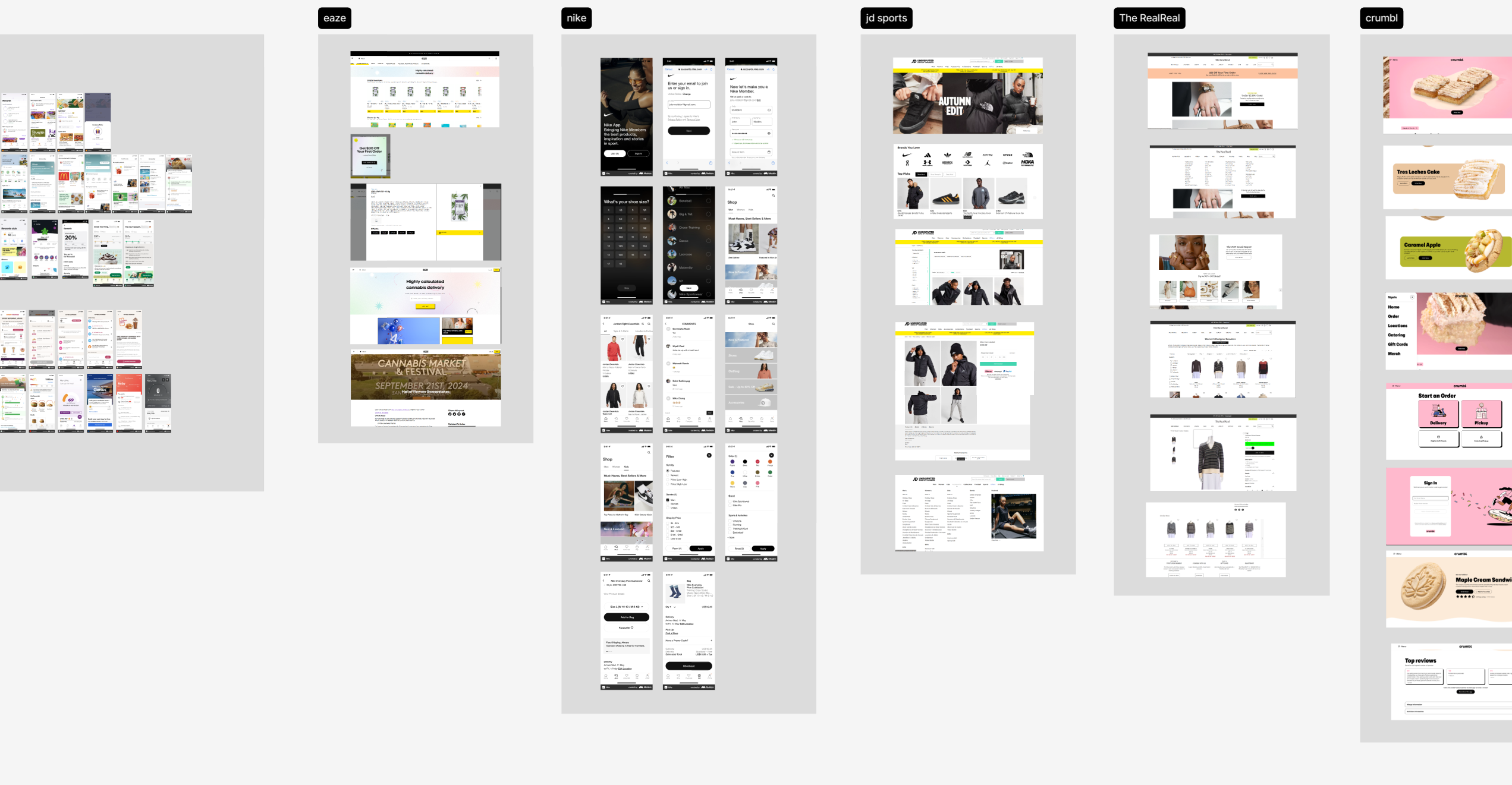
A collage of screenshots from various mobile applications, used for market analysis and benchmarking at the start of the Cookies project. This research helped to identify best practices and potential pitfalls in related industries.
Collaborative Design Sprints
Engaged in weekly, fixed meetings with the Cookies team to present UX deliverables, gather feedback, and iterate on designs, ensuring constant alignment with business goals and legal constraints.
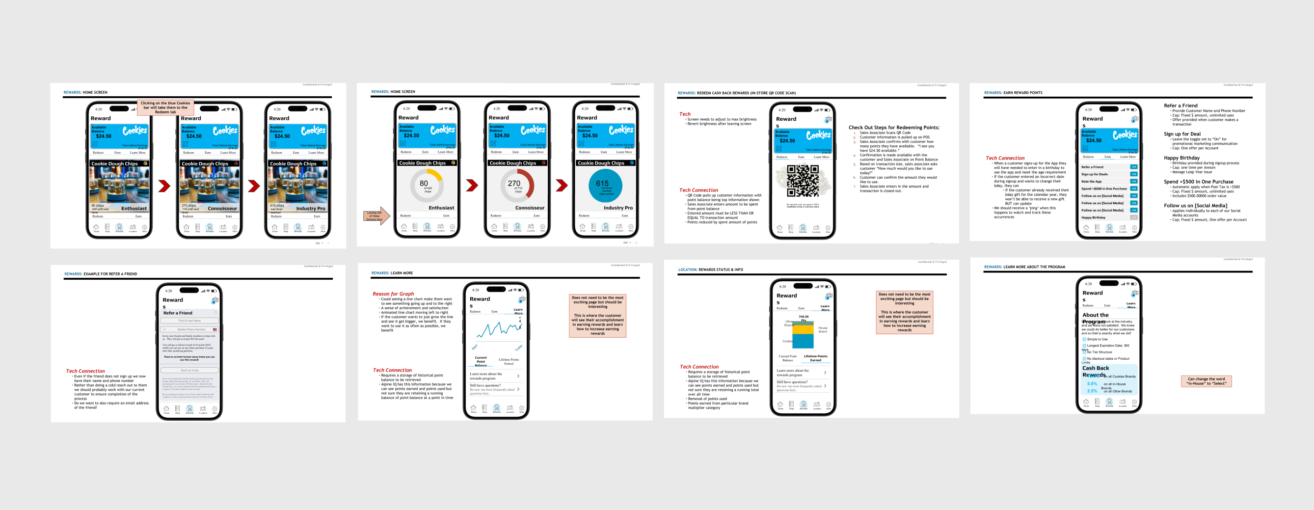
Screenshots showcasing the direct communication and feedback loop with the client through their detailed comments on the design mockups.
Complex Flow Design
Dedicated significant effort to designing the membership onboarding and verification process, creating detailed user flows to handle various state-specific rules and edge cases.
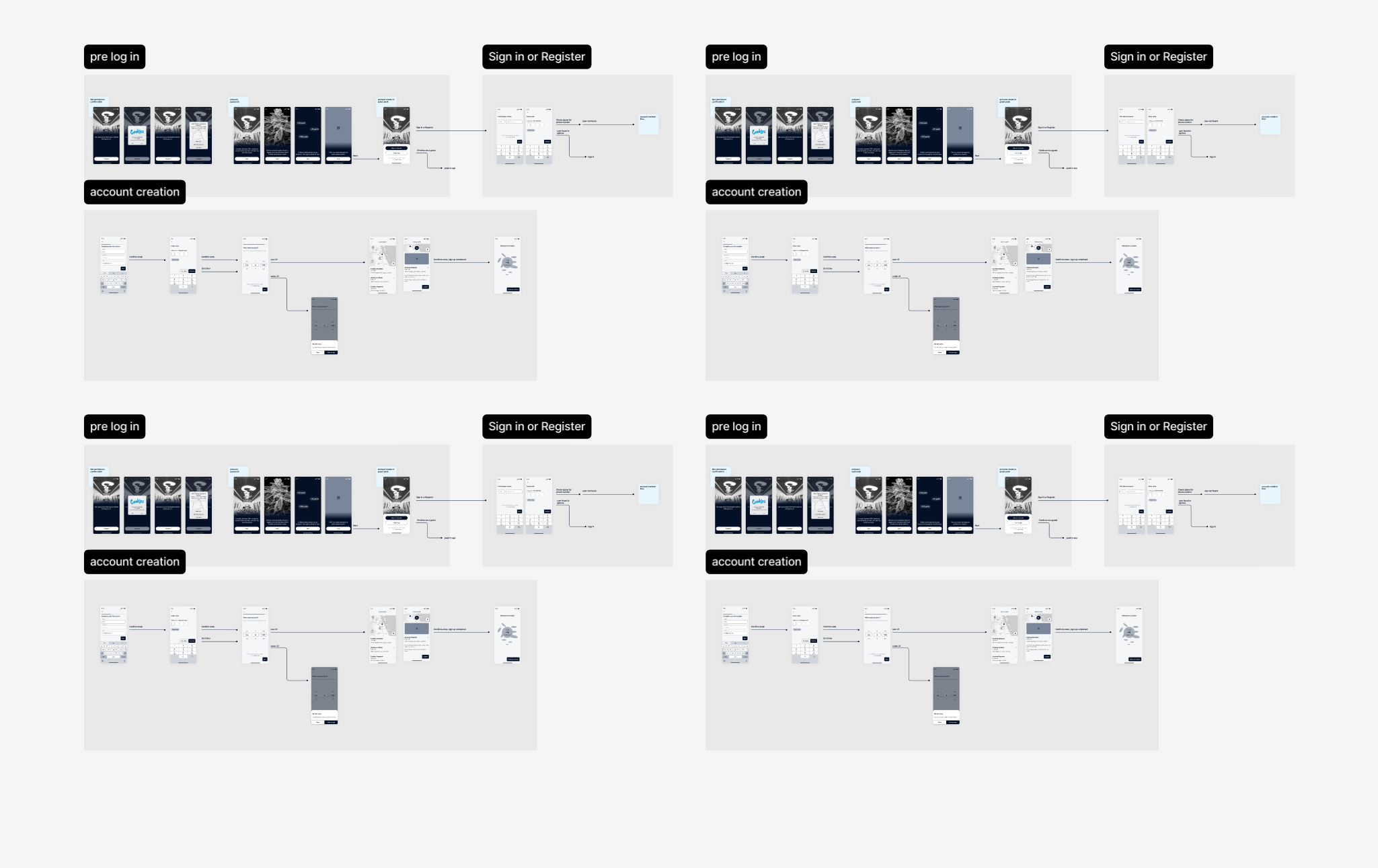
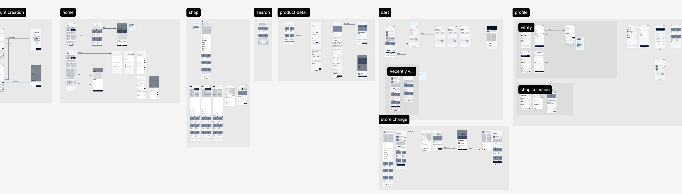
User flow diagrams illustrating the complex, multi-state onboarding and verification process for the Cookies mobile app.
Service Design & Prototyping
Defined the end-to-end user journey from browsing products and creating a cart to the in-store pickup experience. Created wireframes and prototypes to validate these flows.
An overview of the service design and prototyping phase for the Cookies project, displaying interconnected wireframes that map the entire end-to-end user journey.
Impact
Navigated Complex Regulations
Successfully translated a complex web of state-specific legal requirements into an intuitive and easy-to-navigate user onboarding experience.
Provided Solid UX Foundation
Delivered a comprehensive set of UX artifacts, including market analysis, user flows, and wireframes, which provided a robust foundation for the final UI design and development phases.
Bridged Digital and Physical Retail
The designed "browse and reserve" model created a cohesive service that effectively connected the convenience of mobile browsing with the brand's physical store presence.
Ensured Stakeholder Alignment
The regular, collaborative review process ensured that all stakeholders were aligned on the UX direction and that all design decisions were validated against both user needs and business requirements.
Compound - Webpage Design (Case study in progress)
Context
Compound is a startup accelerator that acts as an institutional co-founder and early investor for new companies. They required a new landing page to serve as their primary digital storefront. I was the sole designer on this project.
Problem
Compound needed a compelling and professional landing page that could clearly articulate their unique business model ("institutional co-founder") to potential startup founders. The page had to build trust, explain their partnership model, and provide a clear path for founders to get in touch.
Solution
A comprehensive, single-page website design that tells a compelling story. The design strategically guides the user through different sections: a strong value proposition, details of the partnership, social proof through founder testimonials, an introduction to their team's capabilities, and clear calls-to-action to encourage contact.
Process
Discovery & Strategy
Worked with the Compound team to define the key messages, target audience (early-stage founders), and primary goals for the landing page.
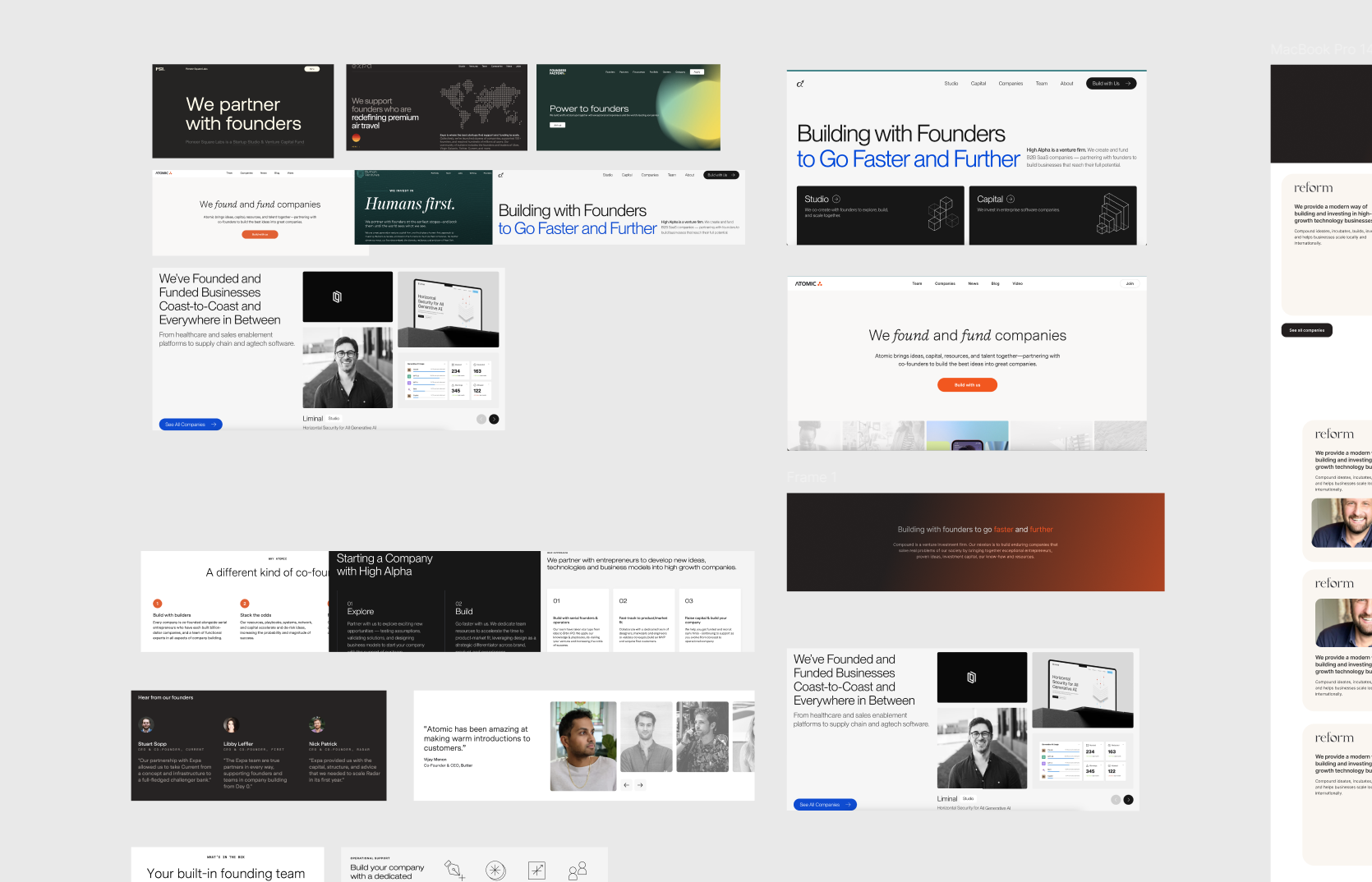
Visual representation of the discovery and strategy phase for the Compound project, displaying a collection of different design concepts used to establish the visual direction.
Information Architecture
Structured the content logically to create a narrative flow, moving from what Compound is, to how they help, to why founders should trust them.
Wireframing & Layout Design
Created wireframes to establish the layout and hierarchy of each section of the landing page.
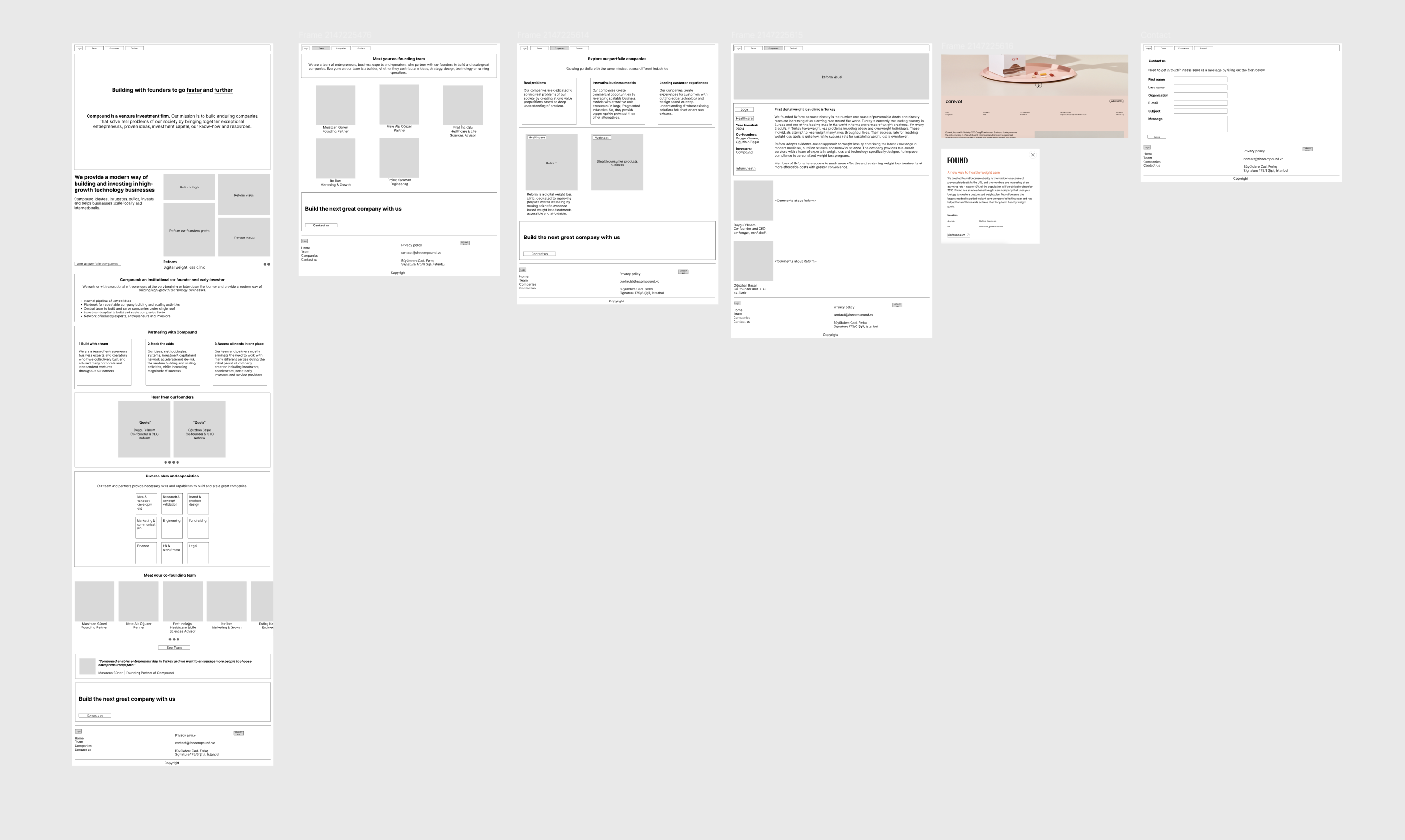
Figma screenshot displaying the wireframing and layout design phase for the Compound project, showing low-fidelity mockups that map out the page's structure and content hierarchy.
Visual Design
Developed a clean, modern, and professional visual identity for the page that conveyed trust and expertise. Designed all UI elements, selected typography, and curated imagery.
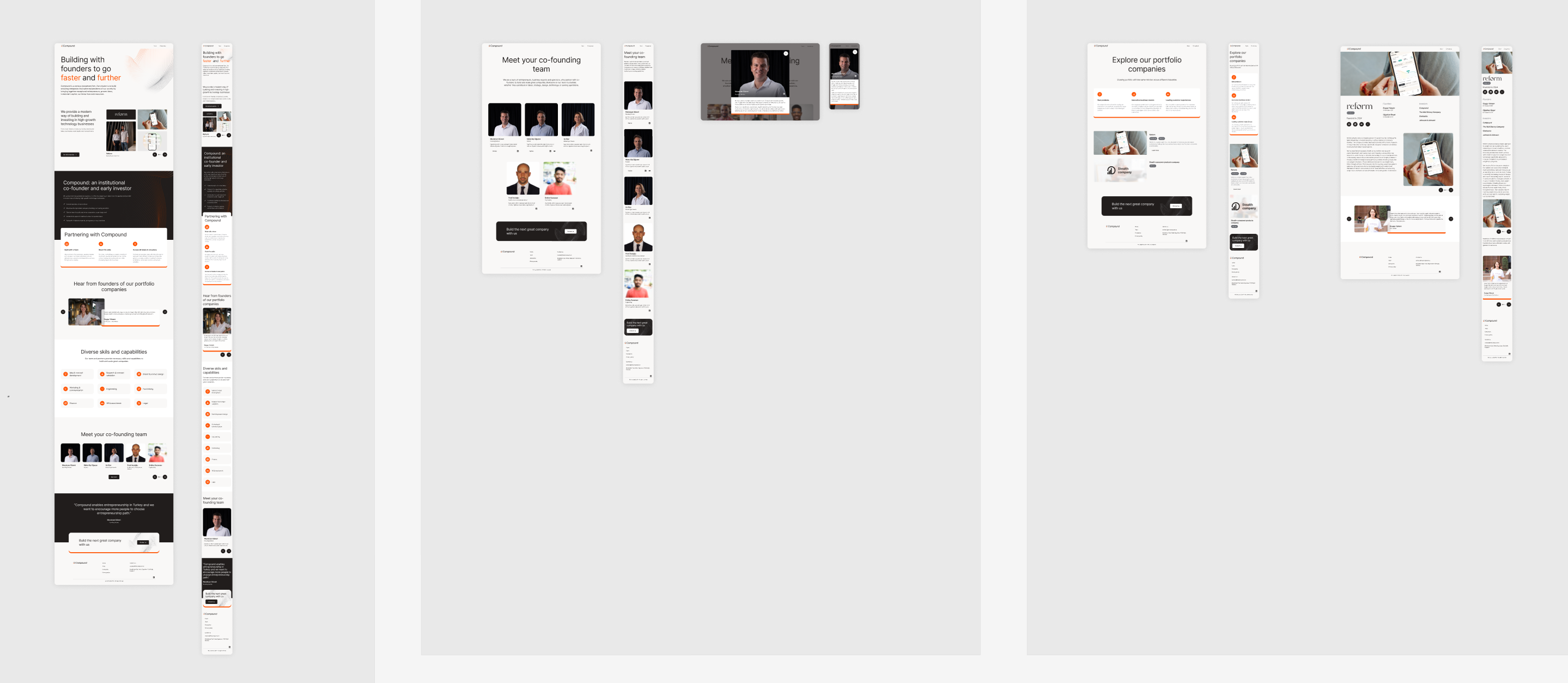
Figma screenshot displaying the final visual design phase for the Compound project, showing various sections of the landing page with the full UI applied.
Component-Based Design
Created reusable components for sections like testimonials and team member profiles to ensure consistency.
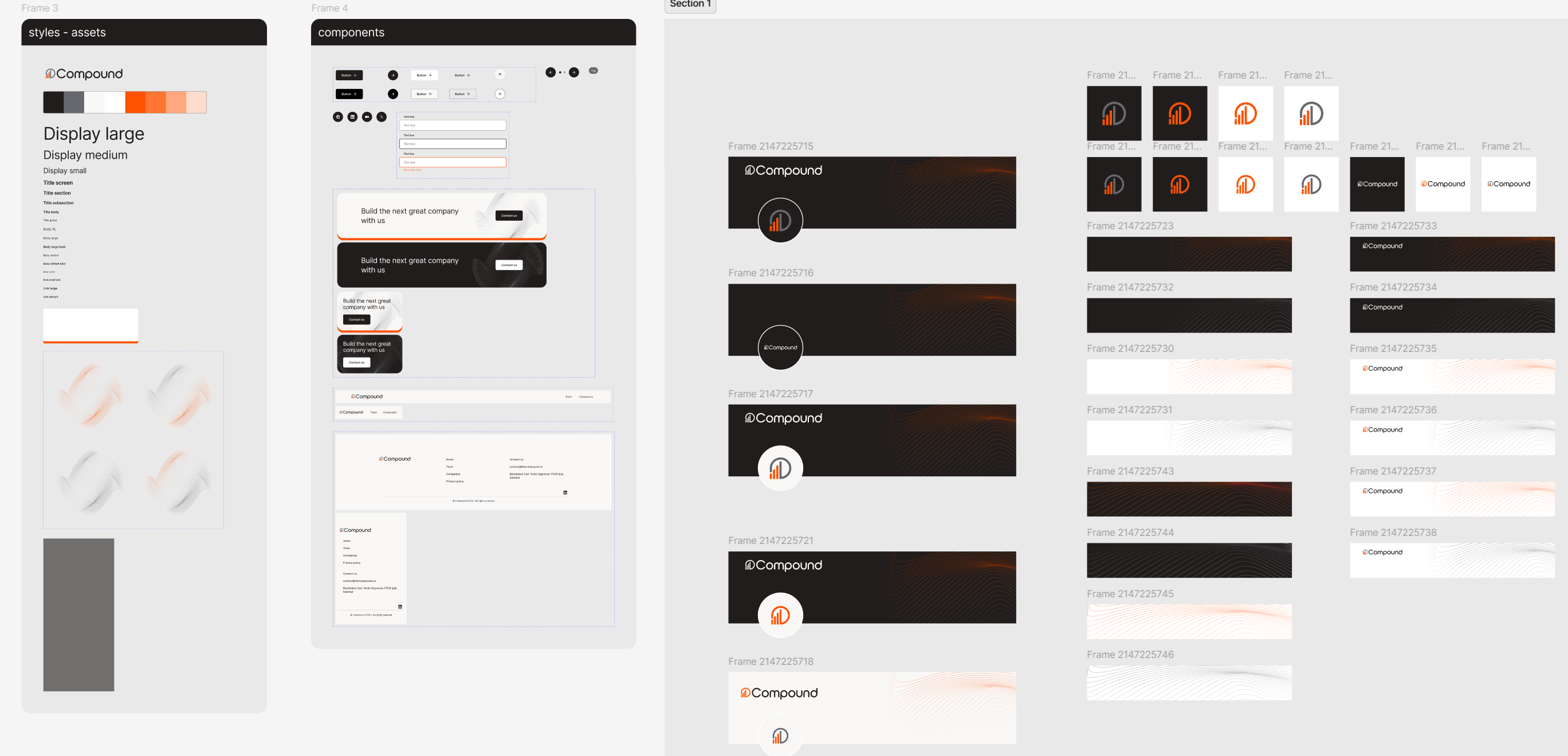
Figma screenshot showcasing the component-based design approach for the Compound project. It displays a library of reusable components, including styles, assets, logos, and UI elements, created to ensure design consistency across the website.
Developer Handoff
Prepared and delivered a well-organized Figma file with all assets and design specifications for development.
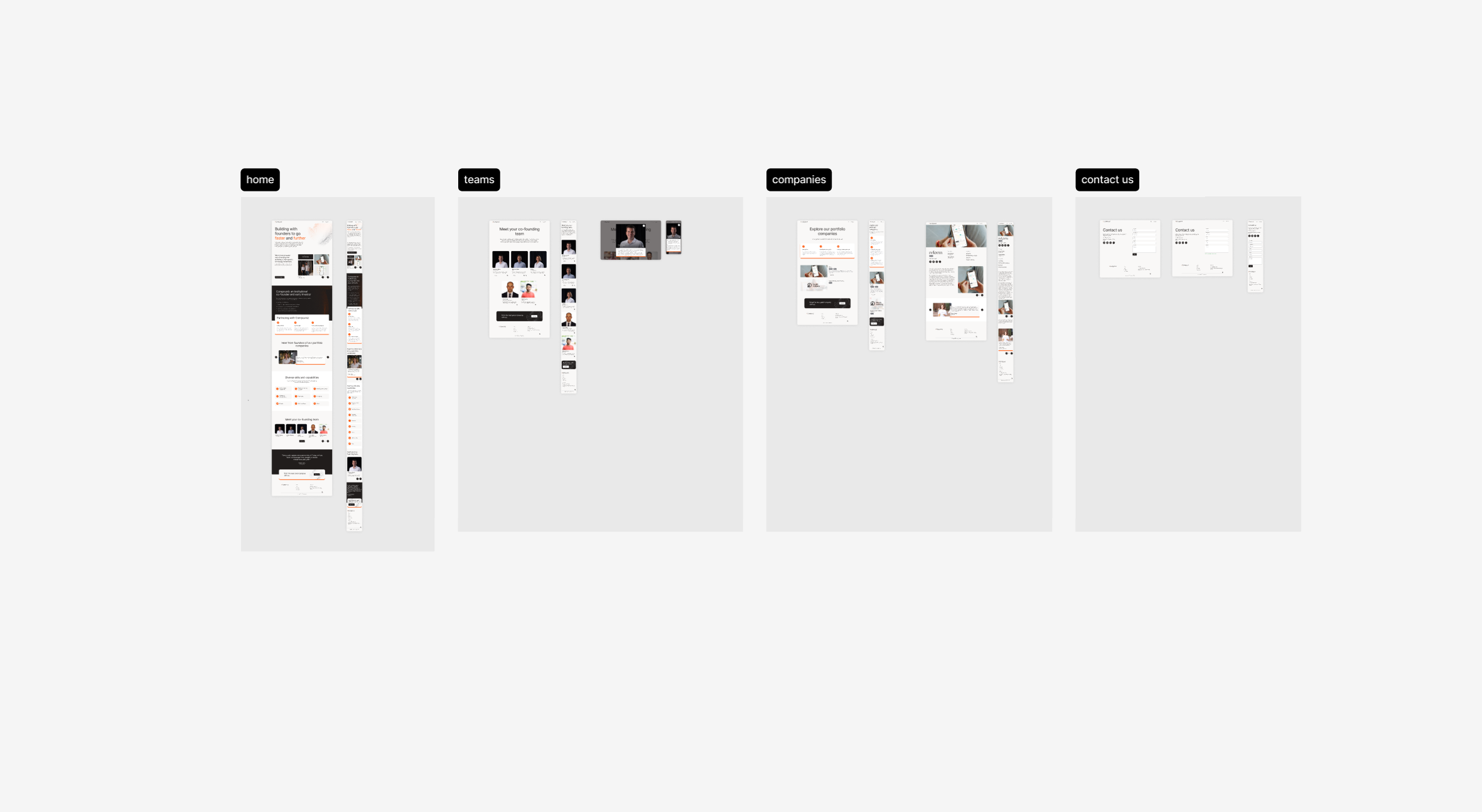
The final, organized layout of the Compound website design in a Figma file, showcasing the key pages as delivered to the development team.
Impact
Clear Communication of Business Model
The final design successfully translated Compound's complex value proposition into an easy-to-understand narrative.
Professional & Trustworthy Brand Image
The modern and clean visual design established a professional and trustworthy online presence, which is crucial for attracting high-quality founders.
Effective Lead Generation Funnel
The page structure and clear calls-to-action created an effective funnel to encourage potential clients to initiate contact.
Provided a Scalable Foundation
The component-based design approach allowed for easy updates and additions to the website as Compound's portfolio and team grew.
Works
Schedule a call
Studio pinto
Working as a freelancer with Studio Pinto, I contributed to various client projects. Each project was realized with unique design solutions, centering on user needs and business objectives. Detailed case studies for these projects can be accessed via the respective links or in subsequent sections of the portfolio.
Studio pinto
Details
Industries
Design agency
My role
Freelance Product Designer
Tools
Figma
•
Rive
•
Miro
•
Framer
My role & Responsibilities
Based on project needs, I undertook a wide range of responsibilities, from concept development and user research to creating wireframes, prototypes, and final visual designs and animations.
- User experience (UX) and user interface (UI) design for clients in various sectors.
- Developing interactive and aesthetically strong designs for web and mobile platforms.
- Translating brand identities into digital environments.

Two Boxes - Webpage and Animation Design
Two Boxes
Context
Two Boxes simplifies the complex operational processes for returned products in online shopping. They approached us (Studio Pinto, with me as the freelance designer) to update their existing web pages and to visually explain their intricate service flow. The project duration was 4 months, and I was the sole designer.
Problem
The primary challenges were to modernize Two Boxes' web presence and to find an engaging and clear way to communicate their complex return logistics and service design to potential clients. Their existing website did not effectively convey the value and intricacies of their solution.
Solution
A comprehensive redesign of their web pages, coupled with custom-designed animations created in Figma (using custom drawings) to illustrate their operational flow. A detailed design guideline was also established. The final website was developed in Framer.
Process
Client Collaboration & Briefing
Worked closely with the Two Boxes team to understand their service, target audience, and project goals.
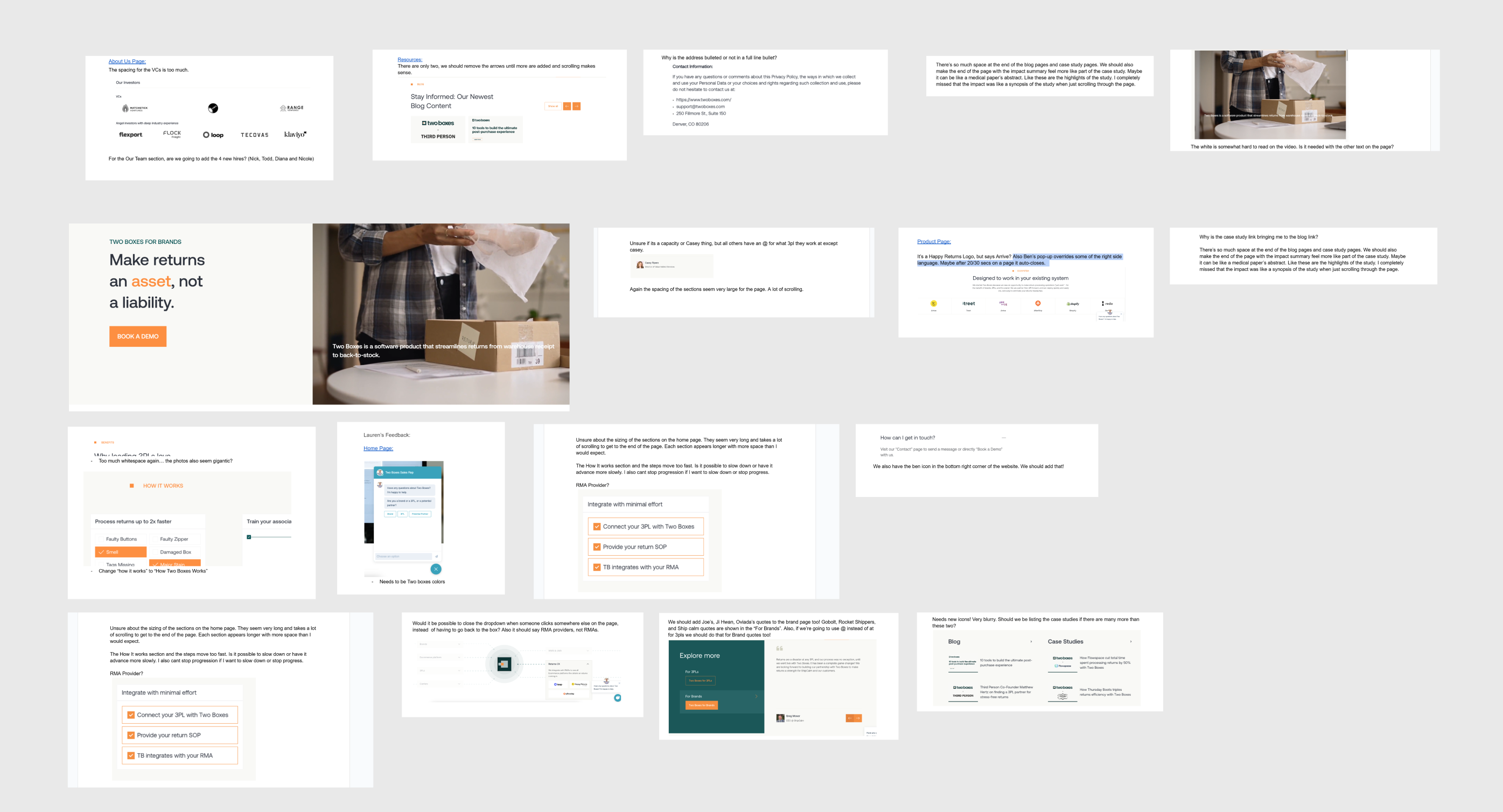
Client feedback and communication examples from the Two Boxes project, showing comments on design mockups.
Web Page Redesign
Conceptualized and designed new layouts for all required web pages, focusing on clarity, user experience, and modern aesthetics.
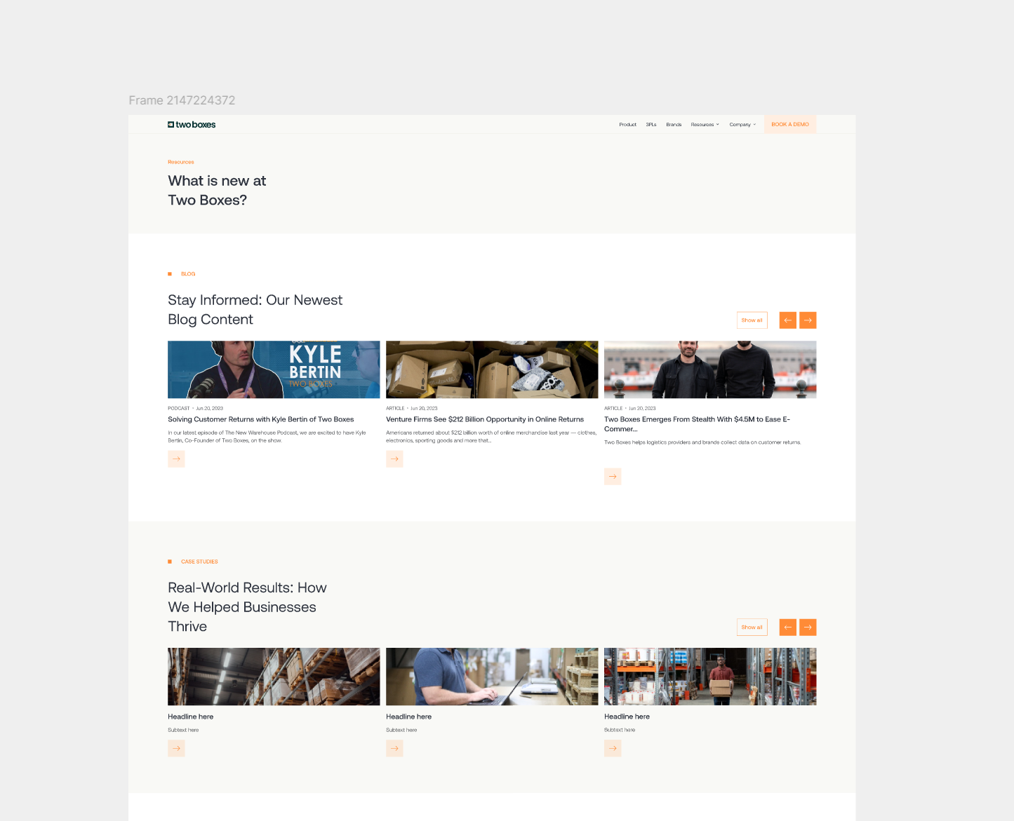
Redesigned webpage layout for Two Boxes, showing blog and results sections.
Animation Design
Designed and created animations directly in Figma using custom illustrations to visually break down and explain Two Boxes' complex service flow.
Website animation video for Two Boxes, showcasing their ecosystem and service integrations.
Design Guideline Creation
Developed a design guideline detailing the usage of fonts, icons, and color palettes to ensure brand consistency.
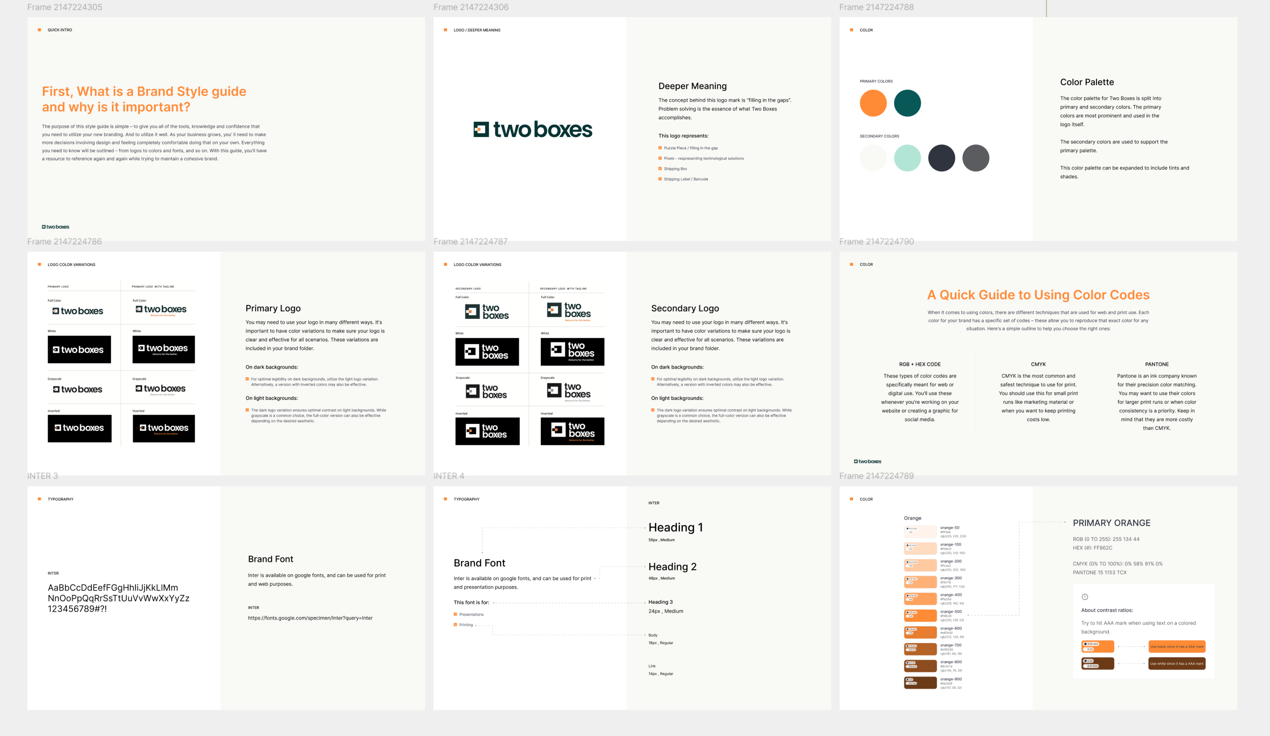
A collection of pages from the Two Boxes brand style guide, establishing rules for brand assets like the logo, colors, and fonts.
Responsive Design
Ensured all screen designs were fully responsive across various devices.
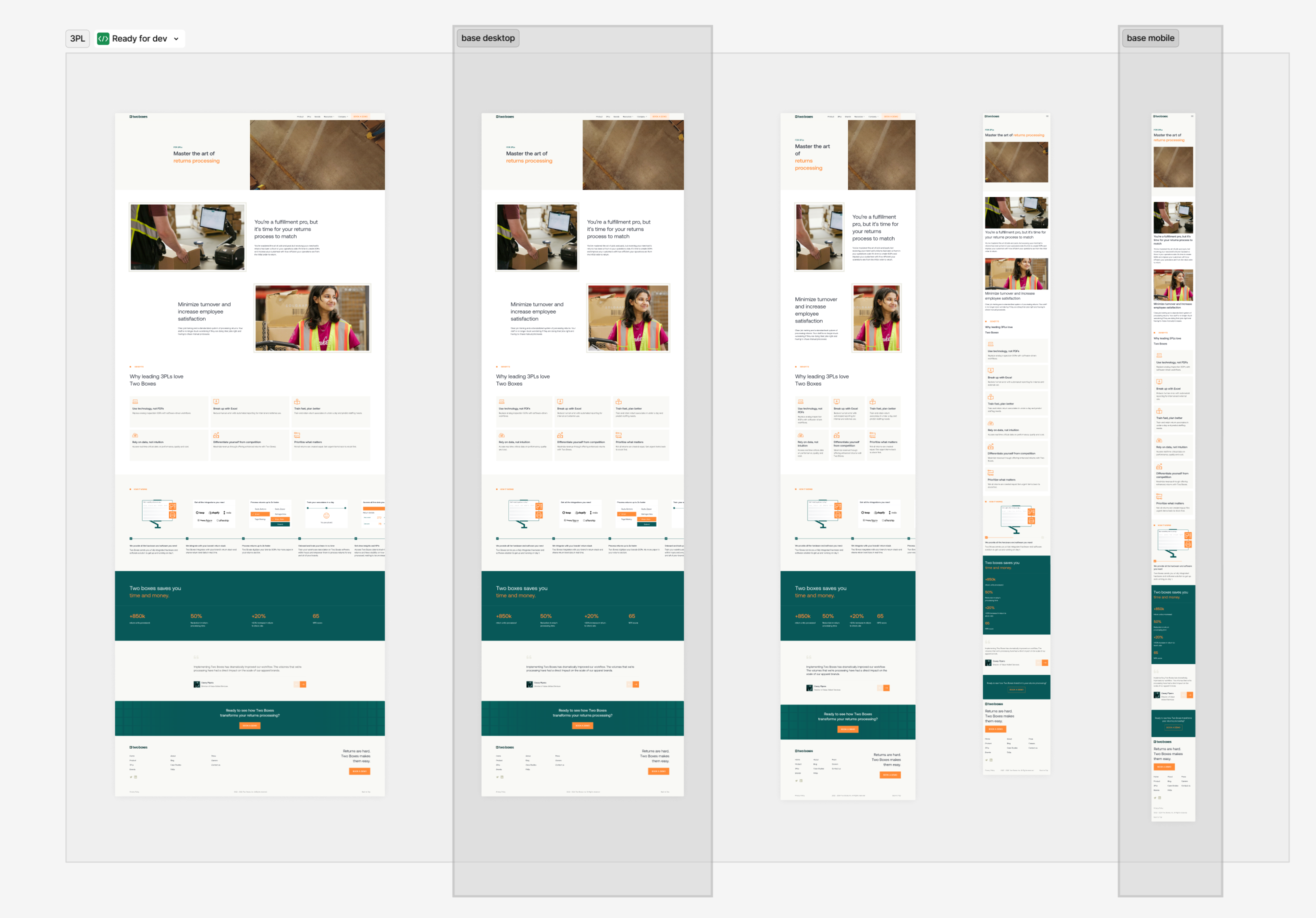
Responsive design mockups for the Two Boxes website, showcasing desktop, tablet, and mobile views.
Developer Handof
Prepared and delivered all design files, including detailed animation specifications, to the developers for implementation in Framer.
Step-by-step animation specifications for developers, showing the start and end states of UI components.
Development Support
Collaborated with developers during the Framer development process to ensure accurate execution of the designs and animations.
Image representing the debugging and development support phase, with the Two Boxes website shown alongside its code.
Impact
Enhanced User Experience
The redesigned website effectively translated Two Boxes' intricate service model into an accessible and engaging user experience.
Clear Value Proposition
Custom animations successfully clarified the complex operational flow, enabling potential clients to better understand the value proposition.
Improved Brand Image
The new, modern aesthetic of the web pages received positive feedback and contributed to a more professional brand image.
Foundation for Consistency
The established design guidelines provided a solid foundation for Two Boxes to maintain brand consistency in their future visual communications.
Smooth Development & Design Fidelity
A well-prepared and detailed handoff, along with ongoing support during development, facilitated a smooth transition to the Framer platform and ensured design fidelity in the final product.
Cookies - Mobile Application UX Design (Case study in progress)
Cookies
Context
Cookies is a leading lifestyle and cannabis brand with physical retail stores. They sought to create a mobile application to enhance their customer experience. I was responsible for the User Experience (UX) design portion of this project over a 4-month period.
Problem
The main challenge was designing a mobile application in a heavily regulated industry. A key problem was creating a user-friendly and compliant membership and onboarding flow, as regulations (such as age limits) vary significantly from state to state. Additionally, the app needed to seamlessly bridge the gap between online browsing and the physical store experience.
Solution
The proposed UX solution was a mobile application focused on a "browse and reserve" model. Users could explore products, build a shopping cart, and seamlessly check out to pick up their order at a physical store. The core of the solution was a meticulously designed, state-aware onboarding and age verification flow that guided users through the complex legal requirements in a clear and simple manner.
Process
Market Analysis & Benchmarking
Began the project by conducting a thorough market analysis and benchmarking of existing applications in similar or related regulated industries to identify best practices and potential pitfalls.
A collage of screenshots from various mobile applications, used for market analysis and benchmarking at the start of the Cookies project. This research helped to identify best practices and potential pitfalls in related industries.
Collaborative Design Sprints
Engaged in weekly, fixed meetings with the Cookies team to present UX deliverables, gather feedback, and iterate on designs, ensuring constant alignment with business goals and legal constraints.
Screenshots showcasing the direct communication and feedback loop with the client through their detailed comments on the design mockups.
Complex Flow Design
Dedicated significant effort to designing the membership onboarding and verification process, creating detailed user flows to handle various state-specific rules and edge cases.
User flow diagrams illustrating the complex, multi-state onboarding and verification process for the Cookies mobile app.
Service Design & Prototyping
Defined the end-to-end user journey from browsing products and creating a cart to the in-store pickup experience. Created wireframes and prototypes to validate these flows.
An overview of the service design and prototyping phase for the Cookies project, displaying interconnected wireframes that map the entire end-to-end user journey.
Impact
Navigated Complex Regulations
Successfully translated a complex web of state-specific legal requirements into an intuitive and easy-to-navigate user onboarding experience.
Provided Solid UX Foundation
Delivered a comprehensive set of UX artifacts, including market analysis, user flows, and wireframes, which provided a robust foundation for the final UI design and development phases.
Bridged Digital and Physical Retail
The designed "browse and reserve" model created a cohesive service that effectively connected the convenience of mobile browsing with the brand's physical store presence.
Ensured Stakeholder Alignment
The regular, collaborative review process ensured that all stakeholders were aligned on the UX direction and that all design decisions were validated against both user needs and business requirements.
Compound - Webpage Design (Case study in progress)
Context
Compound is a startup accelerator that acts as an institutional co-founder and early investor for new companies. They required a new landing page to serve as their primary digital storefront. I was the sole designer on this project.
Problem
Compound needed a compelling and professional landing page that could clearly articulate their unique business model ("institutional co-founder") to potential startup founders. The page had to build trust, explain their partnership model, and provide a clear path for founders to get in touch.
Solution
A comprehensive, single-page website design that tells a compelling story. The design strategically guides the user through different sections: a strong value proposition, details of the partnership, social proof through founder testimonials, an introduction to their team's capabilities, and clear calls-to-action to encourage contact.
Process
Discovery & Strategy
Worked with the Compound team to define the key messages, target audience (early-stage founders), and primary goals for the landing page.
Visual representation of the discovery and strategy phase for the Compound project, displaying a collection of different design concepts used to establish the visual direction.
Information Architecture
Structured the content logically to create a narrative flow, moving from what Compound is, to how they help, to why founders should trust them.
Wireframing & Layout Design
Created wireframes to establish the layout and hierarchy of each section of the landing page.
Figma screenshot displaying the wireframing and layout design phase for the Compound project, showing low-fidelity mockups that map out the page's structure and content hierarchy.
Visual Design
Developed a clean, modern, and professional visual identity for the page that conveyed trust and expertise. Designed all UI elements, selected typography, and curated imagery.
Figma screenshot displaying the final visual design phase for the Compound project, showing various sections of the landing page with the full UI applied.
Component-Based Design
Created reusable components for sections like testimonials and team member profiles to ensure consistency.
Figma screenshot showcasing the component-based design approach for the Compound project. It displays a library of reusable components, including styles, assets, logos, and UI elements, created to ensure design consistency across the website.
Developer Handoff
Prepared and delivered a well-organized Figma file with all assets and design specifications for development.
The final, organized layout of the Compound website design in a Figma file, showcasing the key pages as delivered to the development team.
Impact
Clear Communication of Business Model
The final design successfully translated Compound's complex value proposition into an easy-to-understand narrative.
Professional & Trustworthy Brand Image
The modern and clean visual design established a professional and trustworthy online presence, which is crucial for attracting high-quality founders.
Effective Lead Generation Funnel
The page structure and clear calls-to-action created an effective funnel to encourage potential clients to initiate contact.
Provided a Scalable Foundation
The component-based design approach allowed for easy updates and additions to the website as Compound's portfolio and team grew.
Works
Schedule a call

Ekin Aydemir
Product designer
Work experience
2025

Now
Design System & Motion Designer at Midas
2023
2025
Self Employed Product Designer at Duck rocks
2023
2025
Product Designer at bitaksi
2022
2023
Product Designer at Appcent
2019
2022
Freelance Product Designer
Education
2018
2022
Bachelor of Industrial Design at Middle East Technical University

Download CV
Studio pinto
Working as a freelancer with Studio Pinto, I contributed to various client projects. Each project was realized with unique design solutions, centering on user needs and business objectives. Detailed case studies for these projects can be accessed via the respective links or in subsequent sections of the portfolio.
Studio pinto
Details
Industries
Design agency
My role
Freelance product designer
Tools
Figma
•
Rive
•
Miro
•
Framer
My role & Responsibilities
Based on project needs, I undertook a wide range of responsibilities, from concept development and user research to creating wireframes, prototypes, and final visual designs and animations.
- User experience (UX) and user interface (UI) design for clients in various sectors.
- Developing interactive and aesthetically strong designs for web and mobile platforms.
- Translating brand identities into digital environments.

Two Boxes - Webpage and Animation Design
Two Boxes
Context
Two Boxes simplifies the complex operational processes for returned products in online shopping. They approached us (Studio Pinto, with me as the freelance designer) to update their existing web pages and to visually explain their intricate service flow. The project duration was 4 months, and I was the sole designer.
Problem
The primary challenges were to modernize Two Boxes' web presence and to find an engaging and clear way to communicate their complex return logistics and service design to potential clients. Their existing website did not effectively convey the value and intricacies of their solution.
Solution
A comprehensive redesign of their web pages, coupled with custom-designed animations created in Figma (using custom drawings) to illustrate their operational flow. A detailed design guideline was also established. The final website was developed in Framer.
Process
Client Collaboration & Briefing
Worked closely with the Two Boxes team to understand their service, target audience, and project goals.
Client feedback and communication examples from the Two Boxes project, showing comments on design mockups.
Web Page Redesign
Conceptualized and designed new layouts for all required web pages, focusing on clarity, user experience, and modern aesthetics.
Redesigned webpage layout for Two Boxes, showing blog and results sections.
Animation Design
Designed and created animations directly in Figma using custom illustrations to visually break down and explain Two Boxes' complex service flow.
Website animation video for Two Boxes, showcasing their ecosystem and service integrations.
Design Guideline Creation
Developed a design guideline detailing the usage of fonts, icons, and color palettes to ensure brand consistency.
A collection of pages from the Two Boxes brand style guide, establishing rules for brand assets like the logo, colors, and fonts.
Responsive Design
Ensured all screen designs were fully responsive across various devices.
Responsive design mockups for the Two Boxes website, showcasing desktop, tablet, and mobile views.
Developer Handof
Prepared and delivered all design files, including detailed animation specifications, to the developers for implementation in Framer.
Step-by-step animation specifications for developers, showing the start and end states of UI components.
Development Support
Collaborated with developers during the Framer development process to ensure accurate execution of the designs and animations.
Image representing the debugging and development support phase, with the Two Boxes website shown alongside its code.
Impact
Enhanced User Experience
The redesigned website effectively translated Two Boxes' intricate service model into an accessible and engaging user experience.
Clear Value Proposition
Custom animations successfully clarified the complex operational flow, enabling potential clients to better understand the value proposition.
Improved Brand Image
The new, modern aesthetic of the web pages received positive feedback and contributed to a more professional brand image.
Foundation for Consistency
The established design guidelines provided a solid foundation for Two Boxes to maintain brand consistency in their future visual communications.
Smooth Development & Design Fidelity
A well-prepared and detailed handoff, along with ongoing support during development, facilitated a smooth transition to the Framer platform and ensured design fidelity in the final product.
Cookies - Mobile Application UX Design (Case study in progress)
Cookies
Context
Cookies is a leading lifestyle and cannabis brand with physical retail stores. They sought to create a mobile application to enhance their customer experience. I was responsible for the User Experience (UX) design portion of this project over a 4-month period.
Problem
The main challenge was designing a mobile application in a heavily regulated industry. A key problem was creating a user-friendly and compliant membership and onboarding flow, as regulations (such as age limits) vary significantly from state to state. Additionally, the app needed to seamlessly bridge the gap between online browsing and the physical store experience.
Solution
The proposed UX solution was a mobile application focused on a "browse and reserve" model. Users could explore products, build a shopping cart, and seamlessly check out to pick up their order at a physical store. The core of the solution was a meticulously designed, state-aware onboarding and age verification flow that guided users through the complex legal requirements in a clear and simple manner.
Process
Market Analysis & Benchmarking
Began the project by conducting a thorough market analysis and benchmarking of existing applications in similar or related regulated industries to identify best practices and potential pitfalls.
A collage of screenshots from various mobile applications, used for market analysis and benchmarking at the start of the Cookies project. This research helped to identify best practices and potential pitfalls in related industries.
Collaborative Design Sprints
Engaged in weekly, fixed meetings with the Cookies team to present UX deliverables, gather feedback, and iterate on designs, ensuring constant alignment with business goals and legal constraints.
Screenshots showcasing the direct communication and feedback loop with the client through their detailed comments on the design mockups.
Complex Flow Design
Dedicated significant effort to designing the membership onboarding and verification process, creating detailed user flows to handle various state-specific rules and edge cases.
User flow diagrams illustrating the complex, multi-state onboarding and verification process for the Cookies mobile app.
Service Design & Prototyping
Defined the end-to-end user journey from browsing products and creating a cart to the in-store pickup experience. Created wireframes and prototypes to validate these flows.
An overview of the service design and prototyping phase for the Cookies project, displaying interconnected wireframes that map the entire end-to-end user journey.
Impact
Navigated Complex Regulations
Successfully translated a complex web of state-specific legal requirements into an intuitive and easy-to-navigate user onboarding experience.
Provided Solid UX Foundation
Delivered a comprehensive set of UX artifacts, including market analysis, user flows, and wireframes, which provided a robust foundation for the final UI design and development phases.
Bridged Digital and Physical Retail
The designed "browse and reserve" model created a cohesive service that effectively connected the convenience of mobile browsing with the brand's physical store presence.
Ensured Stakeholder Alignment
The regular, collaborative review process ensured that all stakeholders were aligned on the UX direction and that all design decisions were validated against both user needs and business requirements.
Compound - Webpage Design (Case study in progress)
Context
Compound is a startup accelerator that acts as an institutional co-founder and early investor for new companies. They required a new landing page to serve as their primary digital storefront. I was the sole designer on this project.
Problem
Compound needed a compelling and professional landing page that could clearly articulate their unique business model ("institutional co-founder") to potential startup founders. The page had to build trust, explain their partnership model, and provide a clear path for founders to get in touch.
Solution
A comprehensive, single-page website design that tells a compelling story. The design strategically guides the user through different sections: a strong value proposition, details of the partnership, social proof through founder testimonials, an introduction to their team's capabilities, and clear calls-to-action to encourage contact.
Process
Discovery & Strategy
Worked with the Compound team to define the key messages, target audience (early-stage founders), and primary goals for the landing page.
Visual representation of the discovery and strategy phase for the Compound project, displaying a collection of different design concepts used to establish the visual direction.
Information Architecture
Structured the content logically to create a narrative flow, moving from what Compound is, to how they help, to why founders should trust them.
Wireframing & Layout Design
Created wireframes to establish the layout and hierarchy of each section of the landing page.
Figma screenshot displaying the wireframing and layout design phase for the Compound project, showing low-fidelity mockups that map out the page's structure and content hierarchy.
Visual Design
Developed a clean, modern, and professional visual identity for the page that conveyed trust and expertise. Designed all UI elements, selected typography, and curated imagery.
Figma screenshot displaying the final visual design phase for the Compound project, showing various sections of the landing page with the full UI applied.
Component-Based Design
Created reusable components for sections like testimonials and team member profiles to ensure consistency.
Figma screenshot showcasing the component-based design approach for the Compound project. It displays a library of reusable components, including styles, assets, logos, and UI elements, created to ensure design consistency across the website.
Developer Handoff
Prepared and delivered a well-organized Figma file with all assets and design specifications for development.
The final, organized layout of the Compound website design in a Figma file, showcasing the key pages as delivered to the development team.
Impact
Clear Communication of Business Model
The final design successfully translated Compound's complex value proposition into an easy-to-understand narrative.
Professional & Trustworthy Brand Image
The modern and clean visual design established a professional and trustworthy online presence, which is crucial for attracting high-quality founders.
Effective Lead Generation Funnel
The page structure and clear calls-to-action created an effective funnel to encourage potential clients to initiate contact.
Provided a Scalable Foundation
The component-based design approach allowed for easy updates and additions to the website as Compound's portfolio and team grew.