Works
Schedule a call


Coderspace
As the sole designer in a freelance collaboration with Coderspace, I designed the entire digital presence for '23', a prestigious summit. This included designing their public-facing landing page and a separate, detailed web application for the summit's application process.
Coderspace

Details
Client
Coderspace

Industries
Software Development & IT Consulting
My role
Freelance Product Designer
Tools
Figma
•
Miro
•
Rive
Project Duration
8 mos
My role & Responsibilities
I was responsible for the end-to-end design of both the landing page and the application web app. I acted as a crucial bridge between the business stakeholders at '23' and the development team, translating the project's vision into user-centric designs. This involved explaining to the '23' team how the platform would attract users and streamline their processes, while also providing clear design specifications for the developers.

"23" - Landing Page Design
Yirmiüç
Context
23 is an organization that hosts various events, with the main "Zirve 23" (Summit 23) being their flagship event to connect young talents with industry leaders. They needed a primary website to establish their online identity, communicate their mission, and serve as an information hub for all their activities.
Problem
The primary challenge was to design a website that could effectively serve multiple purposes: act as a general "home" for the '23' brand, provide detailed information about the main "Zirve 23" event, and showcase the people behind the organization (team and alumni). Furthermore, the navigation had to be carefully designed to seamlessly guide users from the public-facing informational site to the separate, more complex application web app.
Solution
The solution was a multi-page website with a clear information architecture. This included a dedicated, detailed page for the "Zirve 23" event, a page to introduce the team and past participants, and a main landing page that served as a hub for general information and other activities. A key part of the solution was developing a thoughtful navigation system that connected these distinct sections and provided a clear gateway to the application portal.
Process
Stakeholder & Strategy Workshops
Collaborated with the '23' team to define the purpose and content for each key page (Home, Summit Page, Team/Alumni Page).
Persuasion Architecture
The site was architected not just to inform, but to persuade. Sections like 'Supporters' were used to establish corporate credibility, while the 'Team' and 'Alumni' sections provided social proof. These elements were strategically placed to directly influence a user's decision to apply.
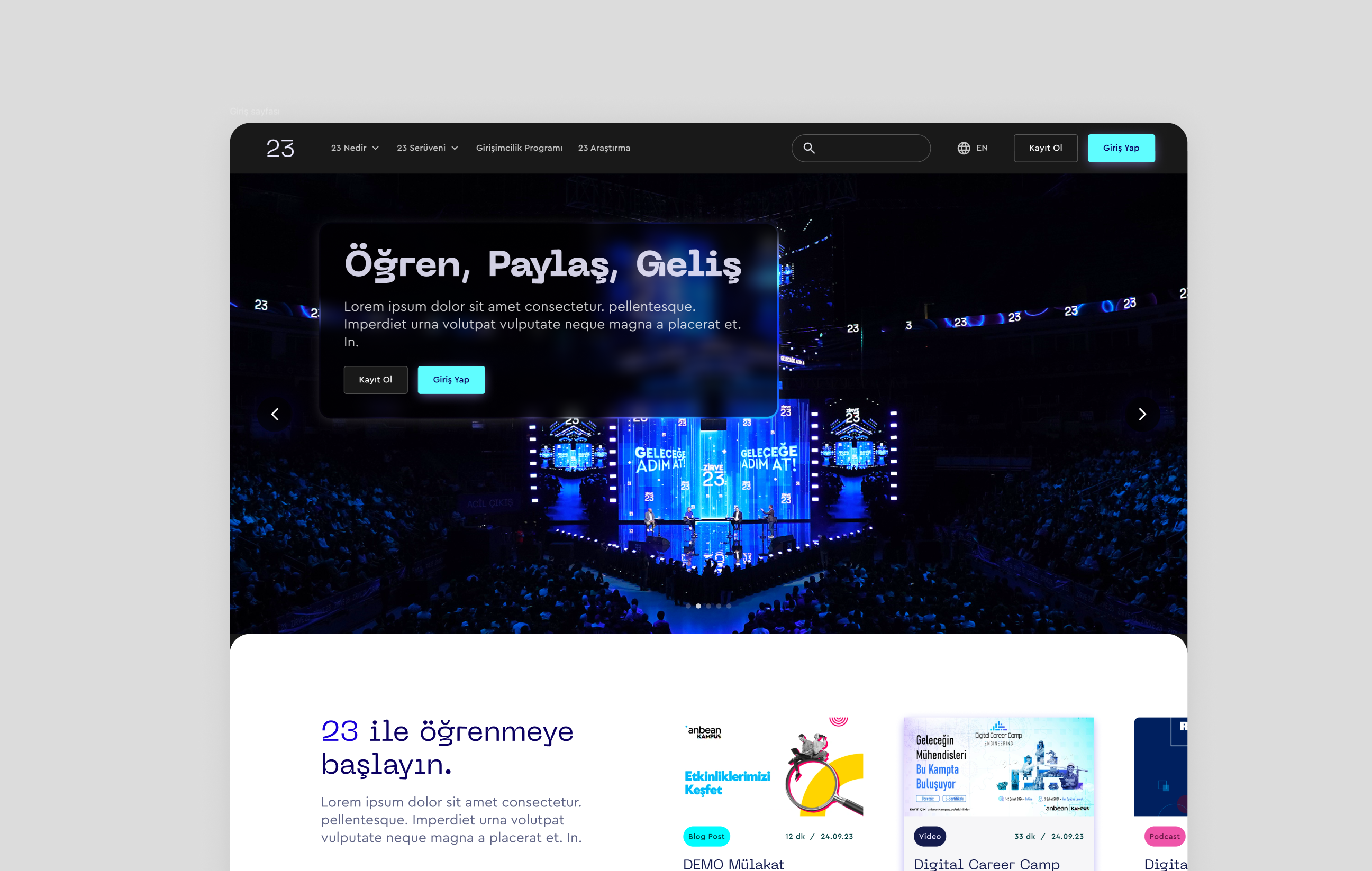
The '23' project's landing page, designed with a focus on persuasion architecture to encourage user engagement and applications.
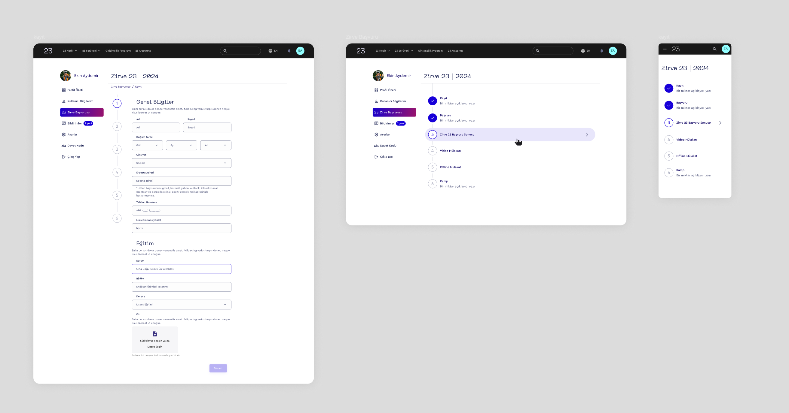
Navigation Design
Developed a complex yet clear navigation system to manage the relationship between the public-facing website and the application web app, ensuring a smooth user journey.
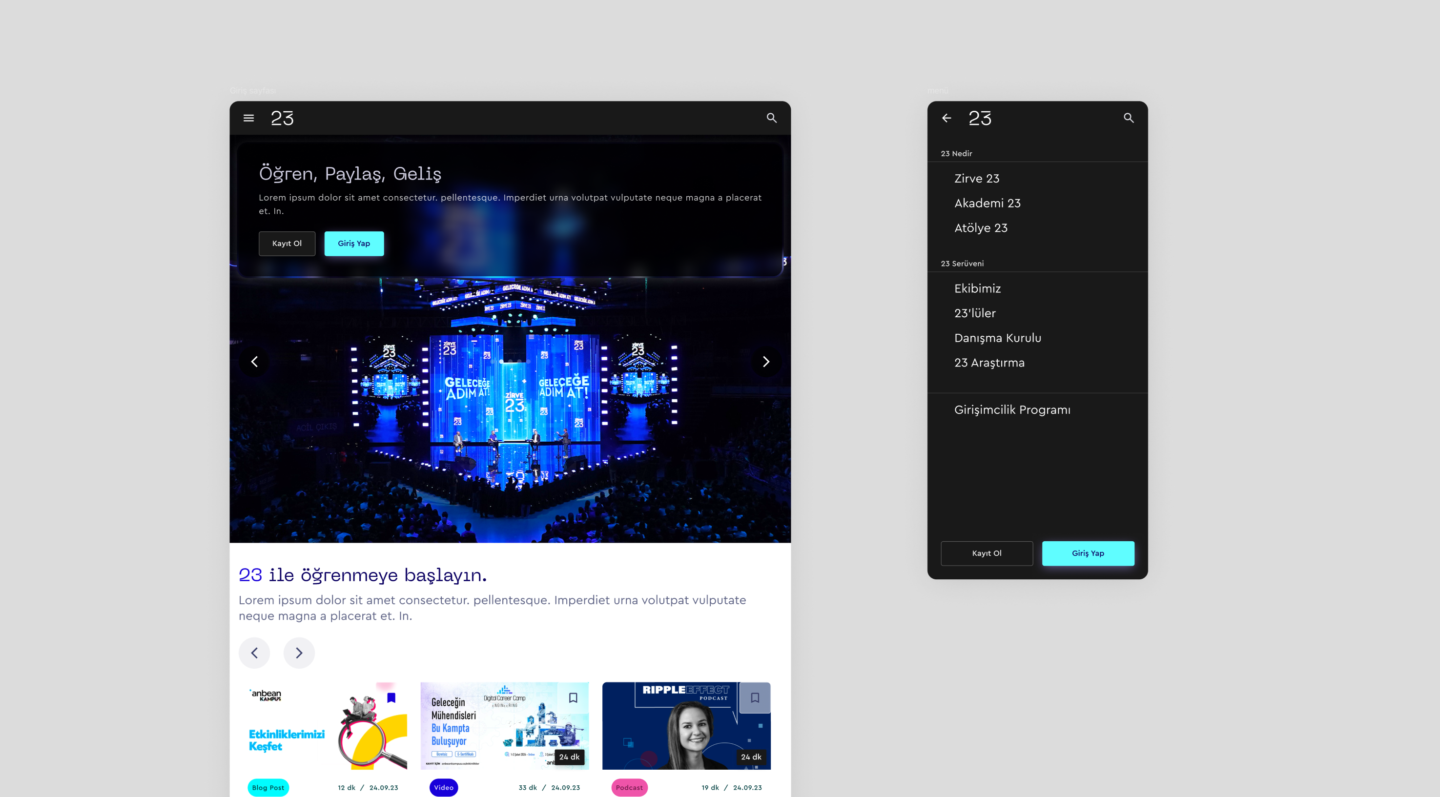
Desktop and mobile navigation menus for the '23' website, designed for a clear and smooth user journey.
Brand Guideline Creation
Established the visual identity for '23' from the ground up by creating their first-ever brand guidelines, defining the logo, color palette, and typography.
The brand style guide for the '23' project, detailing rules for colors, typography, and logo usage.
Banner Design Library
Created a versatile library of banner designs and templates that the '23' team could use across various communication channels and for any future needs, ensuring brand consistency.
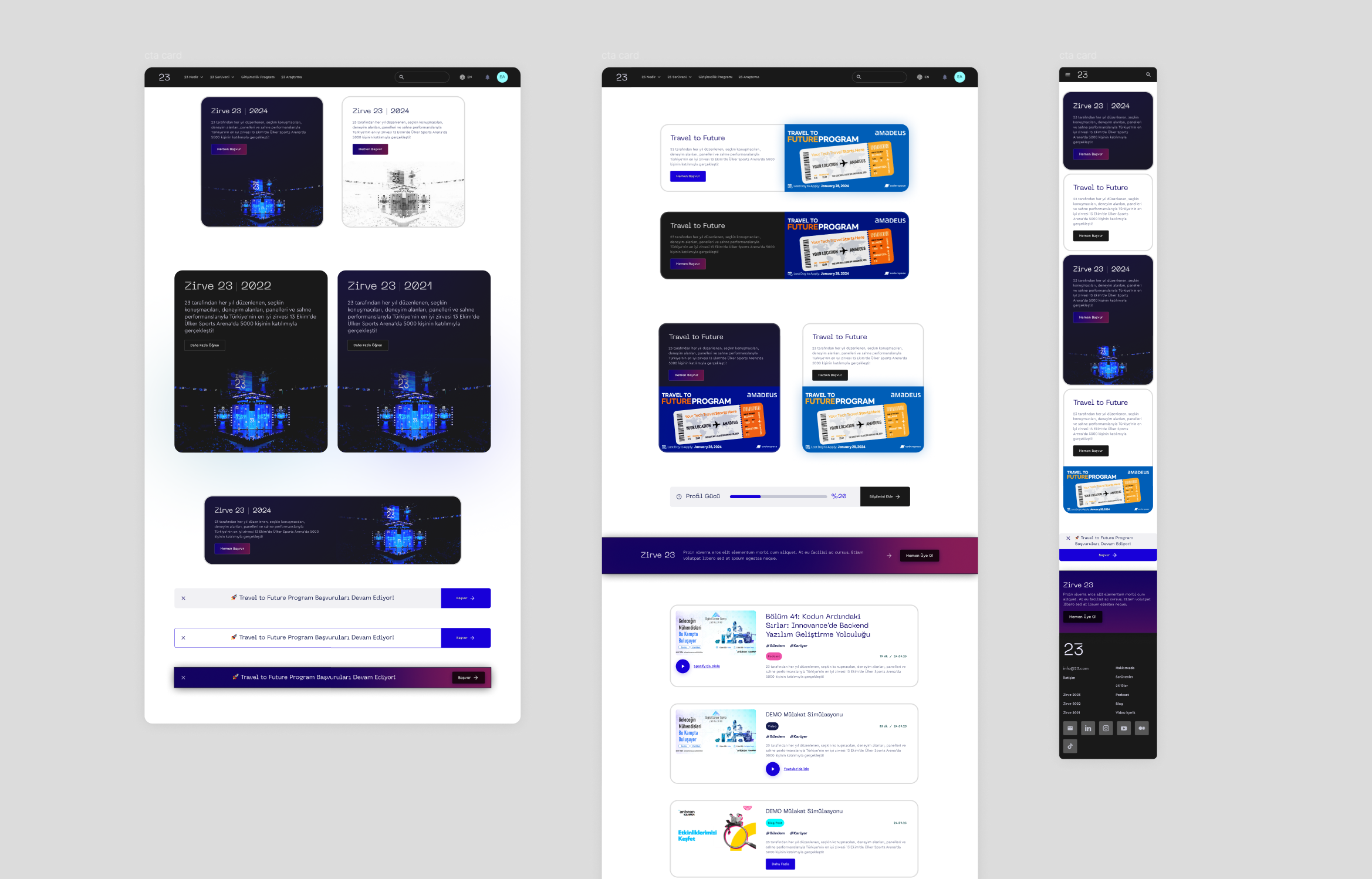
Displaying the banner design library for '23', featuring various templates designed to be used by the team for their marketing and communication needs.
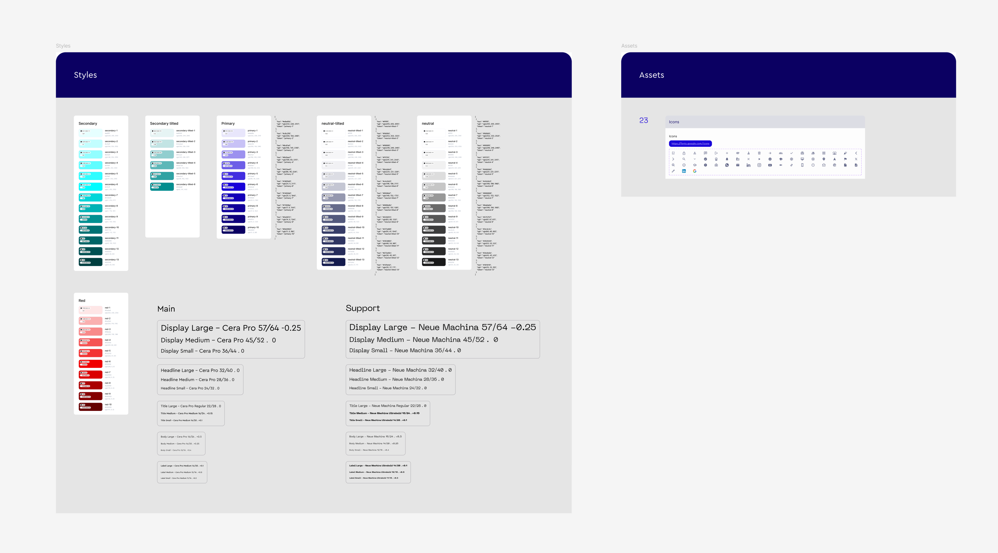
Design System Development
Developed a comprehensive design system in Figma specifically for the landing page to ensure consistency, scalability, and efficiency during development.
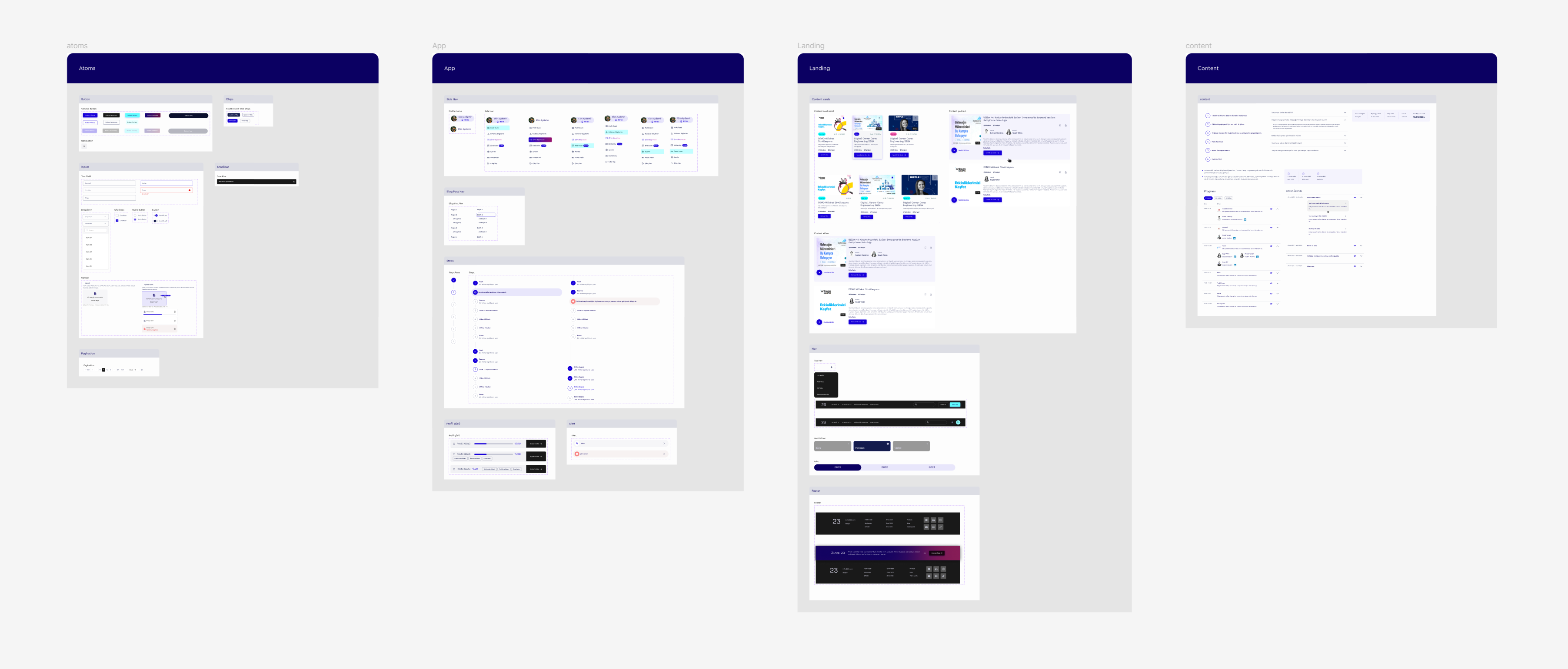
The design system for the '23' landing page, including reusable components and styles.
Impact
Increased Application Rate
The compelling design and persuasive storytelling of the new website successfully captured the interest of potential applicants, contributing to a 50% increase in summit applications.
Established a Cohesive Brand Identity
Created the visual identity for '23' from scratch. The brand guidelines and design system ensured a professional and consistent brand presence across all digital touchpoints.
Effective Communication & Storytelling
The structured, multi-page website design articulated the mission of '23', detailed the specifics of the summit, and built credibility by introducing the team and alumni.
Created an Effective Application Funnel
The site served not just as an informational hub but as an effective funnel, guiding visitors toward the application process through navigation and strategically placed calls-to-action.
Empowered the Client Team
The creation of a design system and a versatile banner library provided the '23' team with the tools to create future marketing materials independently, supporting long-term brand consistency.
"23" - Summit Application Web App
Context
Prior to this project, the '23' summit's application process relied on a disjointed and manual workflow. Applications were gathered through a generic form, while all communication—from status updates to multi-stage elimination feedback—was handled via individual emails, creating a fragmented experience for applicants and a significant administrative burden.
Problem
The manual process presented significant operational and user experience challenges. The primary objective was to create a dedicated digital platform to solve these issues entirely. The key problems were:
For the '23' Team: The existing workflow was highly inefficient, labor-intensive, and prone to human error, making it difficult to effectively track, evaluate, and manage a large volume of applications.
For Applicants: The process lacked transparency and a centralized point of contact, creating a confusing and disjointed experience.
Solution
A comprehensive web application was designed to digitize and organize the entire application and evaluation lifecycle. The solution focused on two key user groups:
For Applicants: A clear, step-by-step application portal that guides them through each stage of the submission.
For the '23' Team: A robust admin dashboard to easily receive, review, filter, evaluate, and provide feedback on applications in an organized manner.
Process
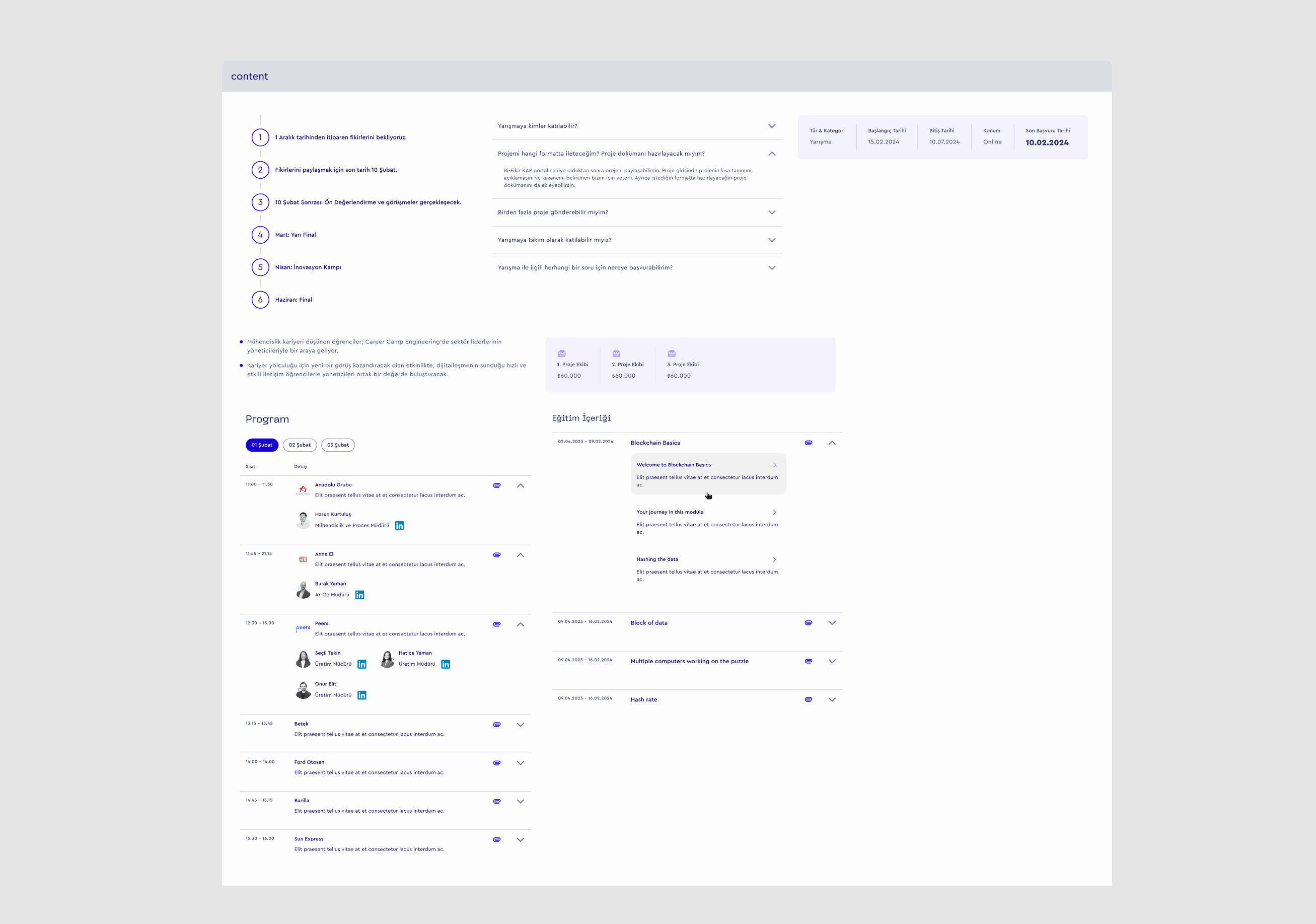
Multi-Step Form Design
Designed a multi-step application form that broke down the complex submission process into manageable sections, allowing applicants to save their progress and complete it over time.
Showcasing the design of the multi-step application form for the '23' project. The visual breaks down a long submission form into smaller, manageable sections, designed to improve the user experience and allow applicants to save their progress.
Dashboard & Data Management
Designed a user-centric dashboard for the administrative team. The interface was equipped with intuitive filtering, sorting, and status-tagging features, enabling efficient management and evaluation of a large volume of applications.
Event and Notification Flows
Designed user flows for how applicants would check for event updates and receive notifications within the platform, thereby centralizing all communication.
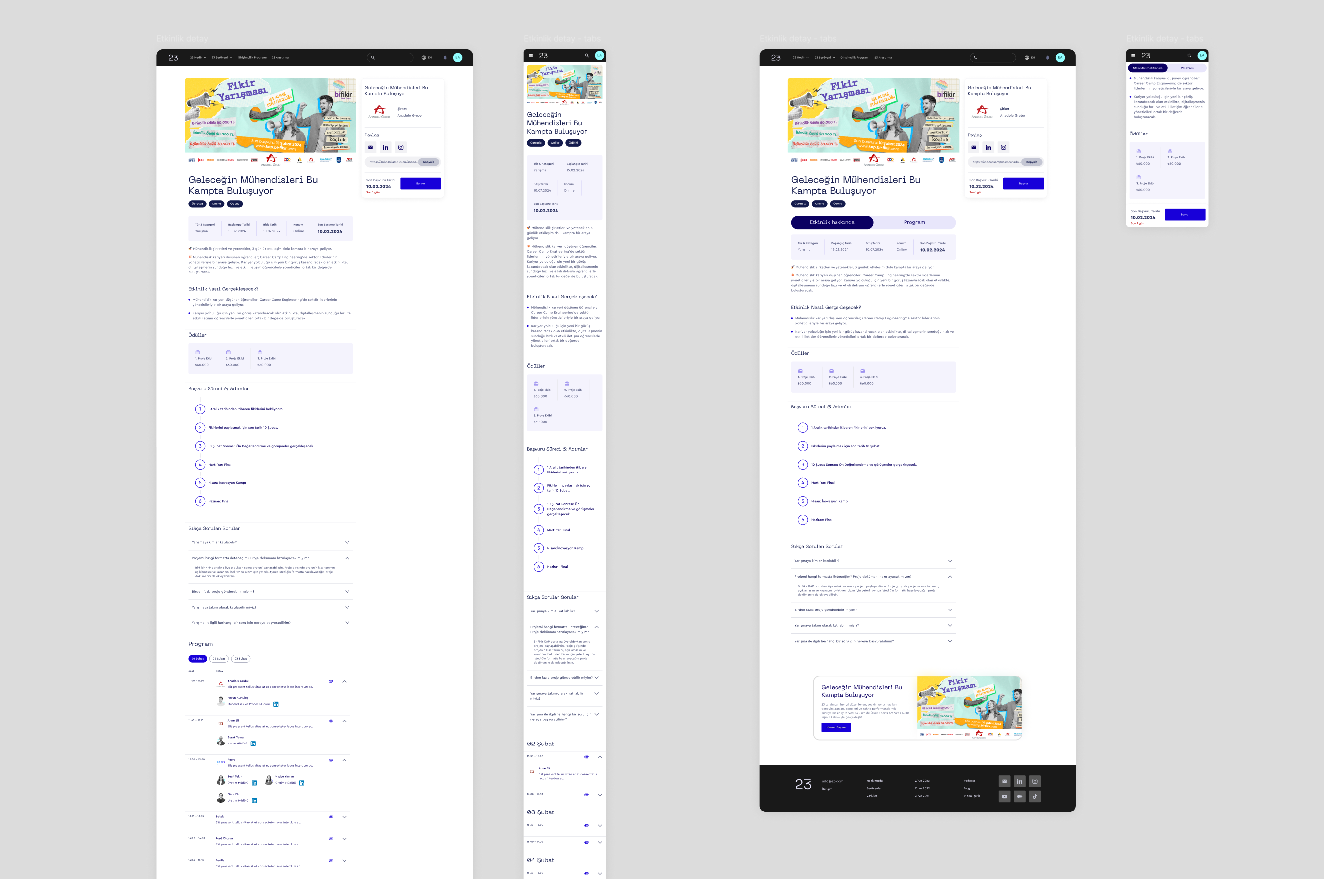
A collage of UI designs for the '23' platform, showcasing how event details and notifications were presented to users. This design centralized all communication within the app.
Application-Specific Design System
Developed a separate, functional design system for the web app to ensure UI consistency across complex components like data tables, forms, and status indicators.
The design system for the '23' web application, including its functional components like tables and forms.
Developer Handoff
Delivered a Figma file with all components, user flows, and detailed specifications to ensure a smooth implementation by the development team.
Impact
Improved Operational Efficiency
The dashboard, designed with filtering and status-tagging capabilities, helped automate the previously manual evaluation process. This reduced the time and administrative burden on the '23' team, allowing them to focus on candidate quality rather than logistics.
Better Applicant Experience
The multi-step application form and the centralized notification system created a more transparent and professional journey for applicants. This approach reduced user confusion and friction, fostering a positive perception of the '23' brand from the first touchpoint.
Centralized & Scalable Management
The application provided a single, reliable platform for the entire application lifecycle. This not only addressed the immediate problems but also created a scalable system capable of handling future growth in application volume.
Works
Schedule a call
Coderspace
As the sole designer in a freelance collaboration with Coderspace, I designed the entire digital presence for '23', a prestigious summit. This included designing their public-facing landing page and a separate, detailed web application for the summit's application process.
Coderspace
Details
Client
Coderspace
Industries
Software Development & IT Consulting
My role
Freelance Product Designer
Tools
Figma
•
Miro
•
Rive
Project Duration
8 mos
My role & Responsibilities
I was responsible for the end-to-end design of both the landing page and the application web app. I acted as a crucial bridge between the business stakeholders at '23' and the development team, translating the project's vision into user-centric designs. This involved explaining to the '23' team how the platform would attract users and streamline their processes, while also providing clear design specifications for the developers.

"23" - Landing Page Design
Yirmiüç
Context
23 is an organization that hosts various events, with the main "Zirve 23" (Summit 23) being their flagship event to connect young talents with industry leaders. They needed a primary website to establish their online identity, communicate their mission, and serve as an information hub for all their activities.
Problem
The primary challenge was to design a website that could effectively serve multiple purposes: act as a general "home" for the '23' brand, provide detailed information about the main "Zirve 23" event, and showcase the people behind the organization (team and alumni). Furthermore, the navigation had to be carefully designed to seamlessly guide users from the public-facing informational site to the separate, more complex application web app.
Solution
The solution was a multi-page website with a clear information architecture. This included a dedicated, detailed page for the "Zirve 23" event, a page to introduce the team and past participants, and a main landing page that served as a hub for general information and other activities. A key part of the solution was developing a thoughtful navigation system that connected these distinct sections and provided a clear gateway to the application portal.
Process
Stakeholder & Strategy Workshops
Collaborated with the '23' team to define the purpose and content for each key page (Home, Summit Page, Team/Alumni Page).
Persuasion Architecture
The site was architected not just to inform, but to persuade. Sections like 'Supporters' were used to establish corporate credibility, while the 'Team' and 'Alumni' sections provided social proof. These elements were strategically placed to directly influence a user's decision to apply.
The '23' project's landing page, designed with a focus on persuasion architecture to encourage user engagement and applications.
Navigation Design
Developed a complex yet clear navigation system to manage the relationship between the public-facing website and the application web app, ensuring a smooth user journey.
Desktop and mobile navigation menus for the '23' website, designed for a clear and smooth user journey.
Brand Guideline Creation
Established the visual identity for '23' from the ground up by creating their first-ever brand guidelines, defining the logo, color palette, and typography.
The brand style guide for the '23' project, detailing rules for colors, typography, and logo usage.
Banner Design Library
Created a versatile library of banner designs and templates that the '23' team could use across various communication channels and for any future needs, ensuring brand consistency.
Displaying the banner design library for '23', featuring various templates designed to be used by the team for their marketing and communication needs.
Design System Development
Developed a comprehensive design system in Figma specifically for the landing page to ensure consistency, scalability, and efficiency during development.
The design system for the '23' landing page, including reusable components and styles.
Impact
Increased Application Rate
The compelling design and persuasive storytelling of the new website successfully captured the interest of potential applicants, contributing to a 50% increase in summit applications.
Established a Cohesive Brand Identity
Created the visual identity for '23' from scratch. The brand guidelines and design system ensured a professional and consistent brand presence across all digital touchpoints.
Effective Communication & Storytelling
The structured, multi-page website design articulated the mission of '23', detailed the specifics of the summit, and built credibility by introducing the team and alumni.
Created an Effective Application Funnel
The site served not just as an informational hub but as an effective funnel, guiding visitors toward the application process through navigation and strategically placed calls-to-action.
Empowered the Client Team
The creation of a design system and a versatile banner library provided the '23' team with the tools to create future marketing materials independently, supporting long-term brand consistency.
"23" - Summit Application Web App
Context
Prior to this project, the '23' summit's application process relied on a disjointed and manual workflow. Applications were gathered through a generic form, while all communication—from status updates to multi-stage elimination feedback—was handled via individual emails, creating a fragmented experience for applicants and a significant administrative burden.
Problem
The manual process presented significant operational and user experience challenges. The primary objective was to create a dedicated digital platform to solve these issues entirely. The key problems were:
For the '23' Team: The existing workflow was highly inefficient, labor-intensive, and prone to human error, making it difficult to effectively track, evaluate, and manage a large volume of applications.
For Applicants: The process lacked transparency and a centralized point of contact, creating a confusing and disjointed experience.
Solution
A comprehensive web application was designed to digitize and organize the entire application and evaluation lifecycle. The solution focused on two key user groups:
For Applicants: A clear, step-by-step application portal that guides them through each stage of the submission.
For the '23' Team: A robust admin dashboard to easily receive, review, filter, evaluate, and provide feedback on applications in an organized manner.
Process
Multi-Step Form Design
Designed a multi-step application form that broke down the complex submission process into manageable sections, allowing applicants to save their progress and complete it over time.
Showcasing the design of the multi-step application form for the '23' project. The visual breaks down a long submission form into smaller, manageable sections, designed to improve the user experience and allow applicants to save their progress.
Dashboard & Data Management
Designed a user-centric dashboard for the administrative team. The interface was equipped with intuitive filtering, sorting, and status-tagging features, enabling efficient management and evaluation of a large volume of applications.
Event and Notification Flows
Designed user flows for how applicants would check for event updates and receive notifications within the platform, thereby centralizing all communication.
A collage of UI designs for the '23' platform, showcasing how event details and notifications were presented to users. This design centralized all communication within the app.
Application-Specific Design System
Developed a separate, functional design system for the web app to ensure UI consistency across complex components like data tables, forms, and status indicators.
The design system for the '23' web application, including its functional components like tables and forms.
Developer Handoff
Delivered a Figma file with all components, user flows, and detailed specifications to ensure a smooth implementation by the development team.
Impact
Improved Operational Efficiency
The dashboard, designed with filtering and status-tagging capabilities, helped automate the previously manual evaluation process. This reduced the time and administrative burden on the '23' team, allowing them to focus on candidate quality rather than logistics.
Better Applicant Experience
The multi-step application form and the centralized notification system created a more transparent and professional journey for applicants. This approach reduced user confusion and friction, fostering a positive perception of the '23' brand from the first touchpoint.
Centralized & Scalable Management
The application provided a single, reliable platform for the entire application lifecycle. This not only addressed the immediate problems but also created a scalable system capable of handling future growth in application volume.
Works
Schedule a call
Ekin Aydemir
Product designer
Work experience
2025

Now
Design System & Motion Designer at Midas
2023
2025
Self Employed Product Designer at Duck rocks
2023
2025
Product Designer at bitaksi
2022
2023
Product Designer at Appcent
2019
2022
Freelance Product Designer
Education
2018
2022
Bachelor of Industrial Design at Middle East Technical University

Download CV
Coderspace
As the sole designer in a freelance collaboration with Coderspace, I designed the entire digital presence for '23', a prestigious summit. This included designing their public-facing landing page and a separate, detailed web application for the summit's application process.
Coderspace
Details
Client
Coderspace
Industries
Software Development & IT Consulting
My role
Freelance Product Designer
Tools
Figma
•
Miro
•
Rive
Project Duration
8 mos
My role & Responsibilities
I was responsible for the end-to-end design of both the landing page and the application web app. I acted as a crucial bridge between the business stakeholders at '23' and the development team, translating the project's vision into user-centric designs. This involved explaining to the '23' team how the platform would attract users and streamline their processes, while also providing clear design specifications for the developers.

"23" - Landing Page Design
Yirmiüç
Context
23 is an organization that hosts various events, with the main "Zirve 23" (Summit 23) being their flagship event to connect young talents with industry leaders. They needed a primary website to establish their online identity, communicate their mission, and serve as an information hub for all their activities.
Problem
The primary challenge was to design a website that could effectively serve multiple purposes: act as a general "home" for the '23' brand, provide detailed information about the main "Zirve 23" event, and showcase the people behind the organization (team and alumni). Furthermore, the navigation had to be carefully designed to seamlessly guide users from the public-facing informational site to the separate, more complex application web app.
Solution
The solution was a multi-page website with a clear information architecture. This included a dedicated, detailed page for the "Zirve 23" event, a page to introduce the team and past participants, and a main landing page that served as a hub for general information and other activities. A key part of the solution was developing a thoughtful navigation system that connected these distinct sections and provided a clear gateway to the application portal.
Process
Stakeholder & Strategy Workshops
Collaborated with the '23' team to define the purpose and content for each key page (Home, Summit Page, Team/Alumni Page).
Persuasion Architecture
The site was architected not just to inform, but to persuade. Sections like 'Supporters' were used to establish corporate credibility, while the 'Team' and 'Alumni' sections provided social proof. These elements were strategically placed to directly influence a user's decision to apply.
The '23' project's landing page, designed with a focus on persuasion architecture to encourage user engagement and applications.
Navigation Design
Developed a complex yet clear navigation system to manage the relationship between the public-facing website and the application web app, ensuring a smooth user journey.
Desktop and mobile navigation menus for the '23' website, designed for a clear and smooth user journey.
Brand Guideline Creation
Established the visual identity for '23' from the ground up by creating their first-ever brand guidelines, defining the logo, color palette, and typography.
The brand style guide for the '23' project, detailing rules for colors, typography, and logo usage.
Banner Design Library
Created a versatile library of banner designs and templates that the '23' team could use across various communication channels and for any future needs, ensuring brand consistency.
Displaying the banner design library for '23', featuring various templates designed to be used by the team for their marketing and communication needs.
Design System Development
Developed a comprehensive design system in Figma specifically for the landing page to ensure consistency, scalability, and efficiency during development.
The design system for the '23' landing page, including reusable components and styles.
Impact
Increased Application Rate
The compelling design and persuasive storytelling of the new website successfully captured the interest of potential applicants, contributing to a 50% increase in summit applications.
Established a Cohesive Brand Identity
Created the visual identity for '23' from scratch. The brand guidelines and design system ensured a professional and consistent brand presence across all digital touchpoints.
Effective Communication & Storytelling
The structured, multi-page website design articulated the mission of '23', detailed the specifics of the summit, and built credibility by introducing the team and alumni.
Created an Effective Application Funnel
The site served not just as an informational hub but as an effective funnel, guiding visitors toward the application process through navigation and strategically placed calls-to-action.
Empowered the Client Team
The creation of a design system and a versatile banner library provided the '23' team with the tools to create future marketing materials independently, supporting long-term brand consistency.
"23" - Summit Application Web App
Context
Prior to this project, the '23' summit's application process relied on a disjointed and manual workflow. Applications were gathered through a generic form, while all communication—from status updates to multi-stage elimination feedback—was handled via individual emails, creating a fragmented experience for applicants and a significant administrative burden.
Problem
The manual process presented significant operational and user experience challenges. The primary objective was to create a dedicated digital platform to solve these issues entirely. The key problems were:
For the '23' Team: The existing workflow was highly inefficient, labor-intensive, and prone to human error, making it difficult to effectively track, evaluate, and manage a large volume of applications.
For Applicants: The process lacked transparency and a centralized point of contact, creating a confusing and disjointed experience.
Solution
A comprehensive web application was designed to digitize and organize the entire application and evaluation lifecycle. The solution focused on two key user groups:
For Applicants: A clear, step-by-step application portal that guides them through each stage of the submission.
For the '23' Team: A robust admin dashboard to easily receive, review, filter, evaluate, and provide feedback on applications in an organized manner.
Process
Multi-Step Form Design
Designed a multi-step application form that broke down the complex submission process into manageable sections, allowing applicants to save their progress and complete it over time.
Showcasing the design of the multi-step application form for the '23' project. The visual breaks down a long submission form into smaller, manageable sections, designed to improve the user experience and allow applicants to save their progress.
Dashboard & Data Management
Designed a user-centric dashboard for the administrative team. The interface was equipped with intuitive filtering, sorting, and status-tagging features, enabling efficient management and evaluation of a large volume of applications.
Event and Notification Flows
Designed user flows for how applicants would check for event updates and receive notifications within the platform, thereby centralizing all communication.
A collage of UI designs for the '23' platform, showcasing how event details and notifications were presented to users. This design centralized all communication within the app.
Application-Specific Design System
Developed a separate, functional design system for the web app to ensure UI consistency across complex components like data tables, forms, and status indicators.
The design system for the '23' web application, including its functional components like tables and forms.
Developer Handoff
Delivered a Figma file with all components, user flows, and detailed specifications to ensure a smooth implementation by the development team.
Impact
Improved Operational Efficiency
The dashboard, designed with filtering and status-tagging capabilities, helped automate the previously manual evaluation process. This reduced the time and administrative burden on the '23' team, allowing them to focus on candidate quality rather than logistics.
Better Applicant Experience
The multi-step application form and the centralized notification system created a more transparent and professional journey for applicants. This approach reduced user confusion and friction, fostering a positive perception of the '23' brand from the first touchpoint.
Centralized & Scalable Management
The application provided a single, reliable platform for the entire application lifecycle. This not only addressed the immediate problems but also created a scalable system capable of handling future growth in application volume.